Multi-brand made easy
Justin Spencer
We’re a truly multi-brand organisation, which is why being able to create individually branded customer experiences while re-using our technical knowledge, digital assets and business processes is so important. This article explains how we achieve this using the GEL Design System, its tools and resources.
Preface
Before launching into the detail its important to first understand what we mean by “multi-brand”.
In 2008 Westpac merged with the St.George Group. Each business in the group had its own unique brand and loyal customer base. Years of work had gone into establishing this heritage, building trust and forging relationships. For Westpac the opportunity lied in leveraging these brands and growing their business.
So we needed a solution that would not only maintain the consistency of all these brands but also facilitate an efficient workflow that would ensure the brands integrity and authenticity was not lost or diluted both now and as they evolve into the future.
Several years later on the cusp of the digital revolution the GEL Design System was born. For almost a decade this system has been the foundation of our digital brands. Everything in the system can be used by all our brands ensuring quality by empowering us to deliver on our brand promises, efficiency through a single source of truth and consistency through design clarity and direction. Using this approach has given us the capacity and confidence to focus on solving real business problems and to design delightful customer experiences.
The design system
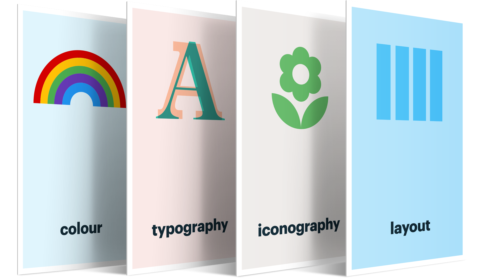
At its core the design system is made up of 4 sub-systems; colour, typography, iconography and layout. These are the foundations of our multi-brand system.
Colour
The colour system is a collection of carefully considered variables (or tokens) designed to work in unison. In consultation with each brand we developed a unique set of corresponding colour values all rigorously tested to ensure brand alignment and guarantee the user interface remained accessible in every possible scenario.
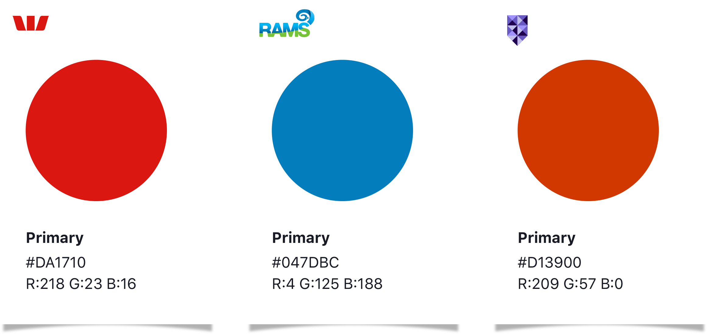
When we reference these colours in our applications we don’t specify the explicit colour value, instead we reference the colours variable (or token). For example the Primary colour in Westpac is #DA1710 however in Rams it’s #047DBC. Our application only needs to know that the Primary colour is being used, the value of that colour is irrelevant.
For more in-depth information on the colour system see the article Colour
Typography
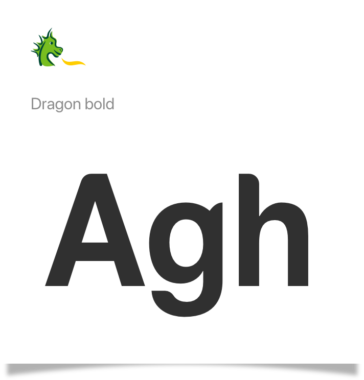
The typography system works in the same way as the colour system. Each brand is assigned two variables we call; Brand font and Body font.
When we reference these fonts in our applications we don’t specify the actual font name. Instead we reference the fonts variable name.
For example, the Brand font in St.George (fig. 2) is Dragon Bold, Bank of Melbourne’s Brand font is LL Brown (fig. 3). Our application only needs to know that the Brand font is being used, the actual typeface used to display the text is irrelevant.

Using variable value pairs to separate the visual layer from the code allows us to theme our applications dynamically which saves time, increases consistency and vastly reduces the margin for error.
For more in-depth information on the typography system see the articles Typography and Using fonts.
Iconography
Also referred to as our Global Visual Language the iconography system is a library of carefully crafted user interface icons shared by all our brands.
Designed to aid navigation and legibility each icon is reduced to its minimal form to ensure readability and clarity at small sizes.
Implemented as SVG (scaleable vector graphics) the icons are both resolution independent and accessible ensuing the highest quality and legibility both now and into the future.
The SVG format also allows us to dynamically control the styling of the icon which means we can apply the colour system to our icons when we need to switch brands.
For more in-depth information on the Iconography system see the article Iconography


Layout
Layout is arguably the most powerful of these sub-systems in part because it uses a mathematical formula based on the number 12. We chose 12 because it’s a highly composite number, divisible by 2, 3, 4, and 6, making it much more flexible than its neighbours. Every aspect of the GEL Design System uses a multiple or divisor of 12 from the number of columns in the responsive grid to the height of a button. This is the key to creating a consistent scale and rhythm throughout the customer journey. It also speeds up the design process and reduces the margin for error during build.
For more in-depth information on the layout system see the article The Grid
Embellishment
In order to differentiate themselves from the competition brands continually strive to be unique. This often conflicts with the idea of a multi-brand design system which focuses on re-use and automation to increase efficiency, consistency and quality.
To cater for this (in digital) we use a layered approach which separates content that can be styled dynamically (using the design system) from content that is brand specific. We call this the embellishment layer.
The embellishment layer makes up approximately 10% of the application. It consists of bespoke graphics, animations, and brand moments typically used in home pages, landing screens, onboarding flows etc. This type of content can not (and should not) be systemised. It’s our opportunity to provide a strong visual link to the master brand across all mediums from point of sale to TVC’s.
The remaining 90% of our applications are made up of hundreds of highly functional screens where customers are typically completing tasks such as applying for a credit card or making a payment. Our main focus here is the customer experience. This is where the power of the design system comes into its own. Not only does it provide tools and resources to quickly design and build these applications but it also provides the ability to roll them out in all brands at the flick of a switch.
In summary; The design system can re-brand 90% of your application instantly. The remaining 10% is unique, brand specific content that should be carefully considered to cater for each brand individually.
Tools
As mentioned, the GEL provides a suite of highly crafted tools and resources. Available to everyone in the organisation these assets are designed to assist you in the creation of amazing digital experiences.
For designers there's the Figma Libraries. A complete set of multi-brand, accessible design assets to help you create high quality, consistent, experiences across all our digital touch-points.
For developers there's the Front End Development Framework. This extensive (React) code base is a mirror image of the Figma library. All assets are categorised and labeled in exactly the same way to ensure that we're all speaking the same language.
Both the Figma Library and the FED Framework use automated multi-brand features to leverage the power of the Design Systems theming capability. Not only does this automation significantly reduce the time and effort required to roll out an experience across all our brands it also removes the margin for error and maintains consistency throughout the customer journey.
A digital first brand
The design system has been so successful it now influences the design direction of all Westpac Group re-brands. From accessible colour pallets to font pairing, every brand is mapped to the system. This momentous cultural shift towards a digital first brand can be largely attributed to the design system and it’s suite of powerful sub-systems, tools and resources.