Iconography
Justin Spencer
Our global visual language is shared across all our brands. We have a library of carefully crafted user interface icons for use in our designs. This article discusses the iconography design principles and provides usage guidelines to ensure that we design icons consistently and use them correctly. For information about embedding, sizing and styling icons please refer to the Design System Iconography.
Usage Guidelines
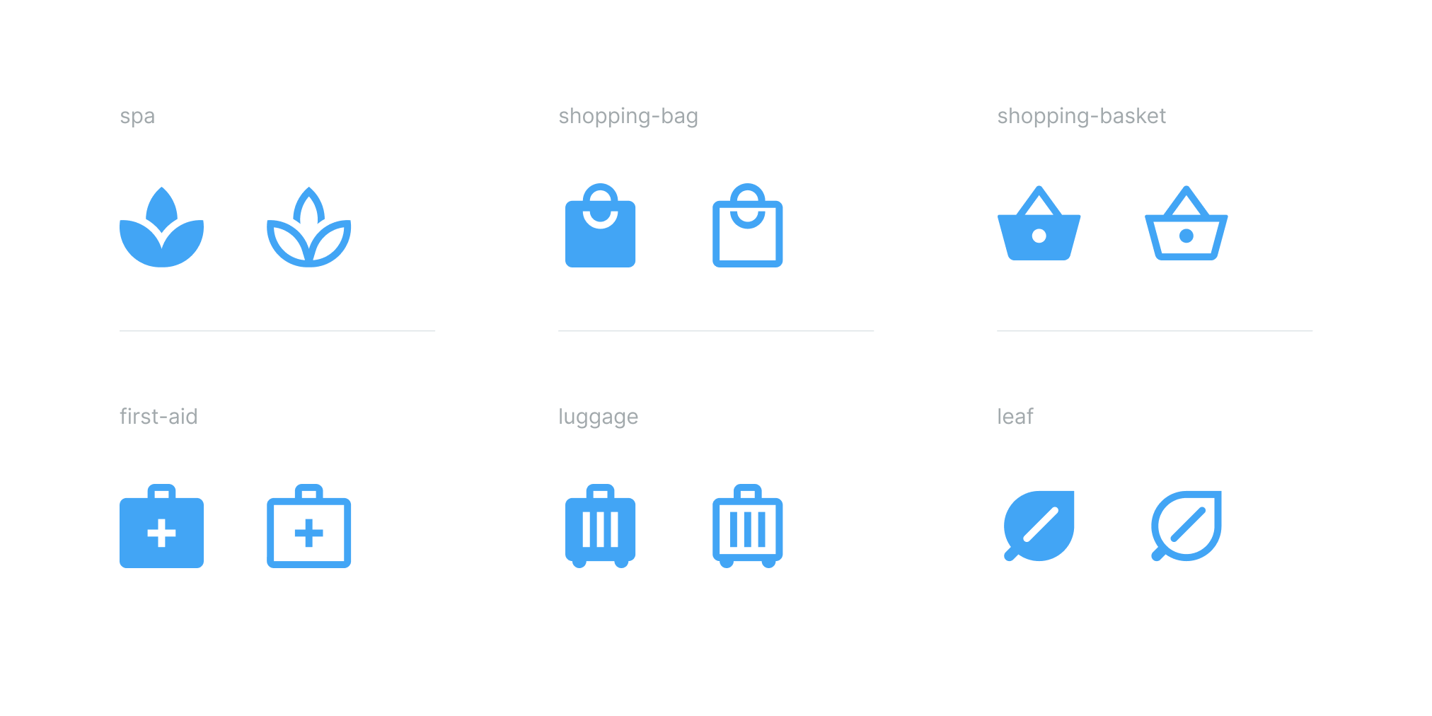
These guidelines are designed to assist you in the correct use of icons. We have a library of almost 300 icons for use in your designs. For those using Figma, every icon has now been tagged with relevant keywords making it easy to find exactly what you're looking for. Please note: These guidelines are high level and may be updated to cater for evolving design and business requirements. If you have any questions or need help please don’t hesitate to contact the GEL team.
When to use icons
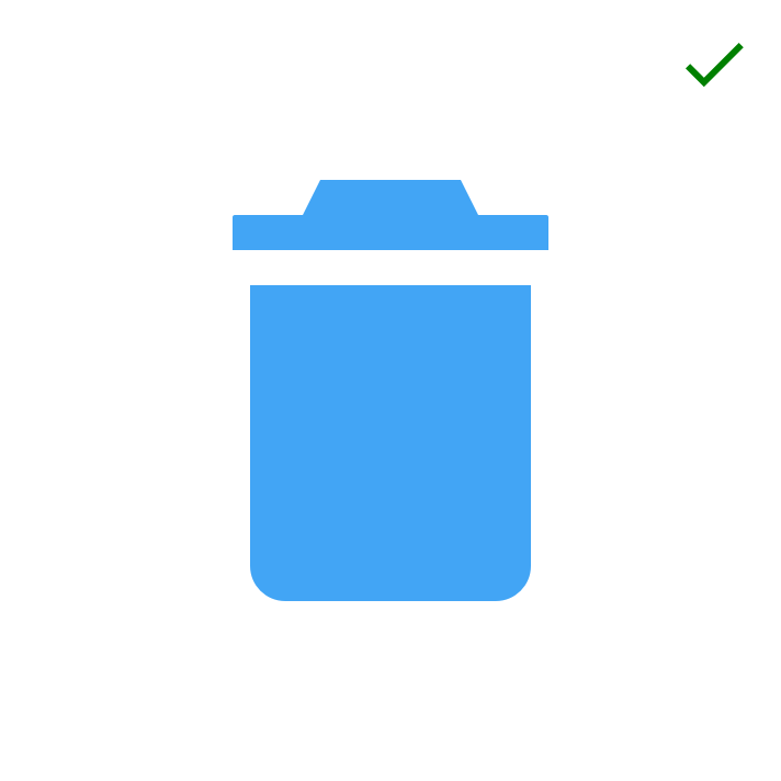
User Interface icons are designed to communicate meaning and aid navigation. They can symbolise a command, file, device or directory. They’re also used to represent common actions like search, print and edit. First and foremost icons are functional, designed to be legible at very small sizes we use them in UI components to assist usability. Icons are not intended to be used as embellishment where the sole purpose is to make something look pretty.
Icon styles
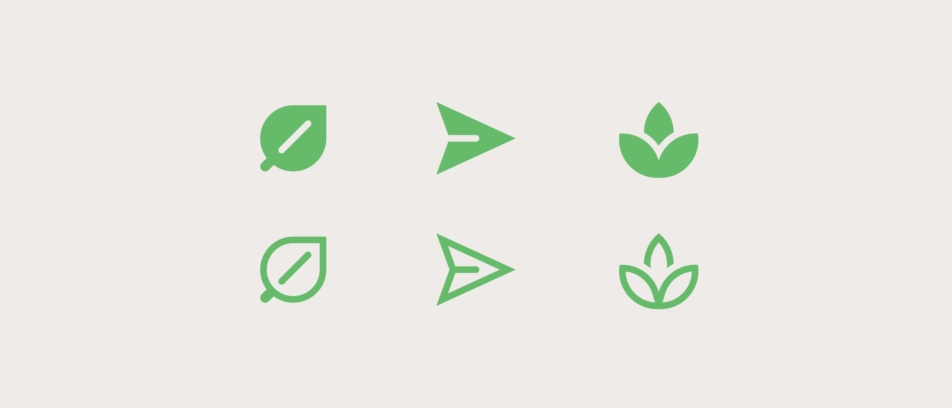
Each icon in the library has 2 variants; filled and outlined as shown in the image below. These variants can be used to visually emphasise or de-emphasise a symbol. Designers can use a combination of filled and outlined icons to help draw attention to what’s important. This approach is similar to using font weights. When we want to emphasise a string of text we typically use a bolder font, this is a very simple and effective way to focus ones attention without the need for additional visual queues. Filled and outlined icons work in exactly the same way where the filled icon is bold and the outlined icon is light.
Filled and outlined variants are also useful when creating menus where the filled variant can represent the selected state, however its important to note that not all icons can have a fill (eg. link) and not all icons can have an outline (eg. accessibility). It's important to consider this before designing a menu that uses icons to indicate selected and unselected states.

Icon labels
Icons should always be accompanied by a label, however in some cases where the icon has become a globally recognised symbol, a label may not be required. For example a house is now the globally recognised symbol for home.
Icon overload
Icons should be used sparingly. Too many icons add clutter and confusion to the interface. The use of UI icons purely as page embellishment is also not recommended, Pictograms would be a better choice in this scenario.
Icons v Pictograms
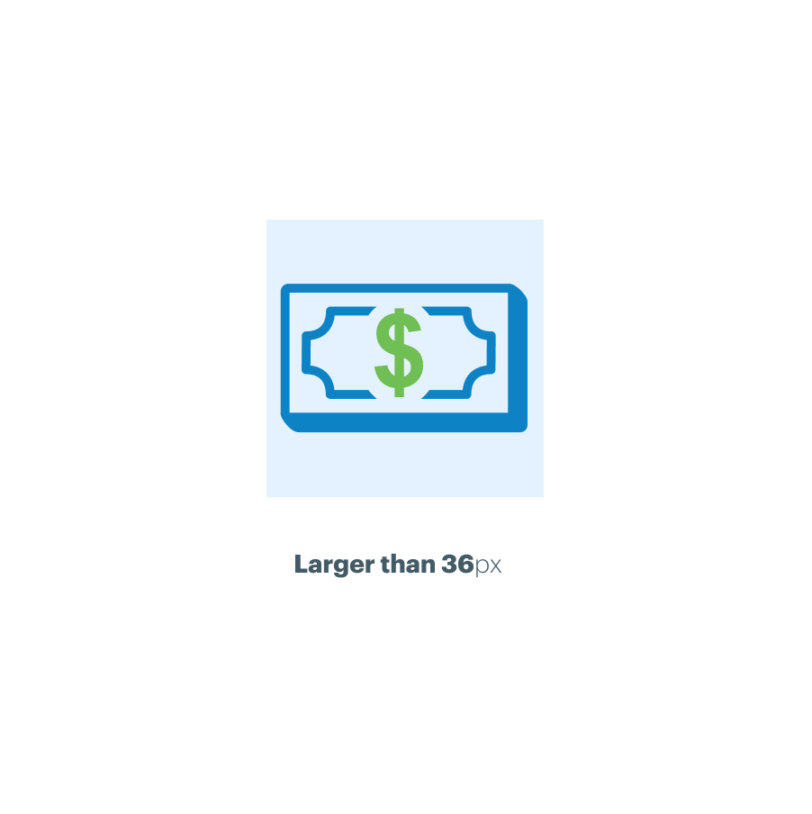
The GEL design system also provides a library of Pictograms. Unlike icons Pictograms are not intended to aid navigation or represent common actions like search and print. The primary purpose of Pictograms is brand embellishment. They’re designed to enhance the brand at specific points in the customer journey, we call these “brand moments”. Given their primary function Pictograms are not designed to be used at small sizes. They’re not drawn on the pixel grid and depending on the brand they may use colours that are not accessible. As a result Pictograms must always be larger than 36px. For more information and downloads please refer to the Design System Pictograms
Design Principles
If you cannot find an icon in the library to suit your needs it’s likely that you’ll need to create your own bespoke icon. The principles below explain how to design and craft icons correctly - aligning to the grid, using the correct corner radius, stroke widths etc. Note: before deciding to design new icons we recommend contacting the GEL team or speaking to your Principle as we may be able to assist with finding a suitable library icon.
Simplicity
Simplicity is the key design requirement for UI icons. Using simple geometric shapes each icon in the library is reduced to its minimal form, just enough to capture the essence of its meaning. This ensures readability and clarity even at small sizes. It also optimises the vector file size by limiting the number of points required to draw the graphic.
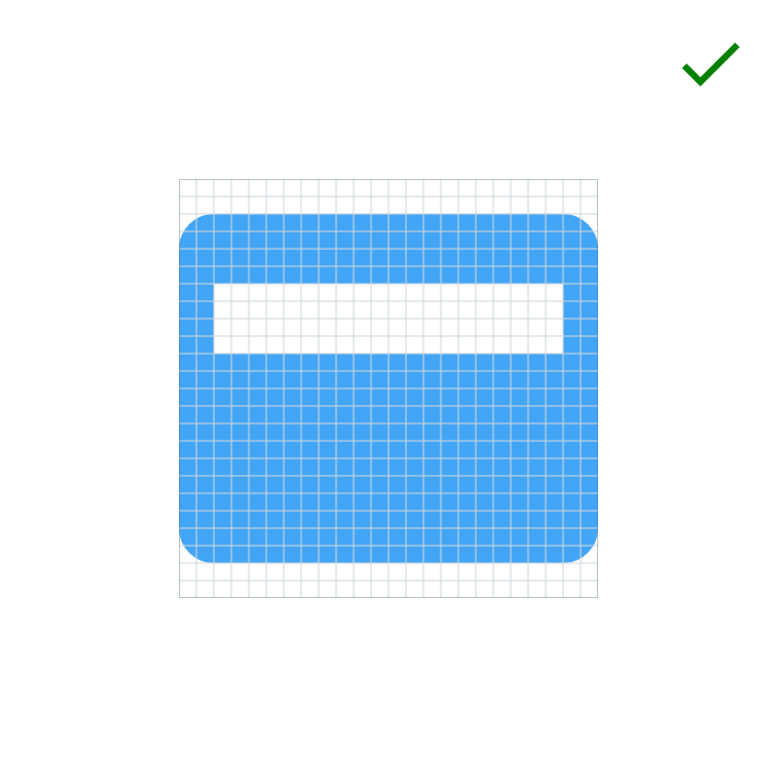
Icon grid
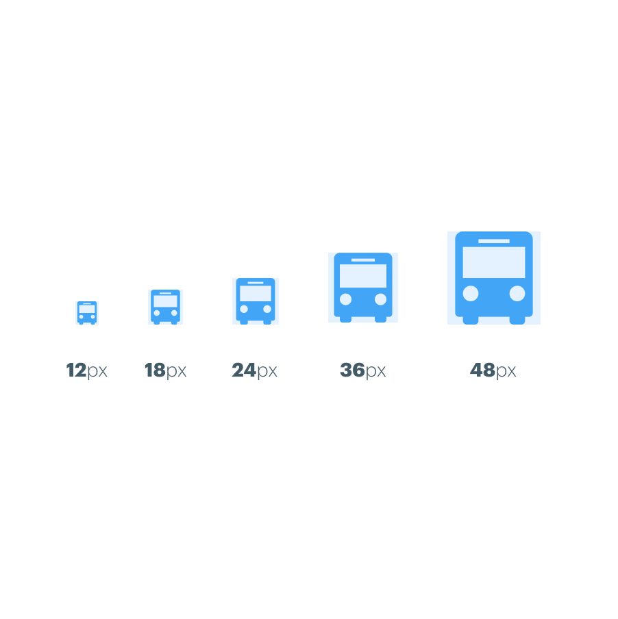
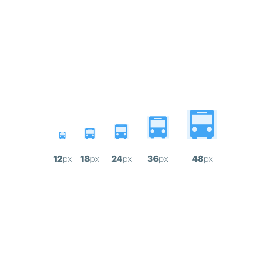
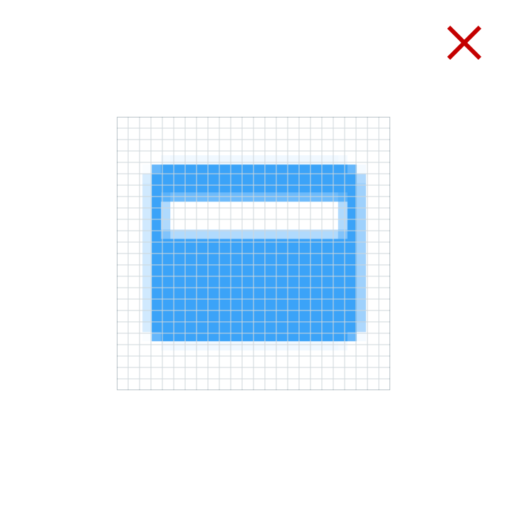
The icon grid has been developed to facilitate consistency while also offering a certain amount of flexibility. All the icons in this library have been designed and crafted on a 24px grid. This allows us to use the icons at the following sizes: XSmall (12px), Small (18px), Medium (24px), Large (36px) and XLarge (48px). Using the icons at these pre-defined sizes will ensure that horizontal and vertical edges align with the pixel grid, with the exception of the Small (18px). This results in a sharper more legible graphic. If icons are not used at these intended sizes they will no longer align to the pixel grid which will result in a blurred effect. Using a fixed set of icon sizes also helps us to maintain consistency across all our applications.
Icon anatomy
Legibility, consistency and simplicity are key design principals for all UI icons. We use simple geometric shapes to construct icons. This gives them a unified symmetry and visual consistency.
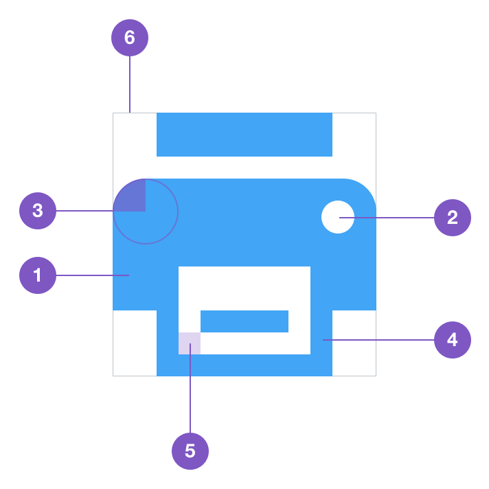
Fill area
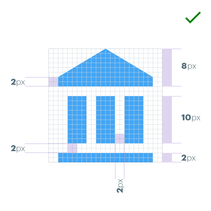
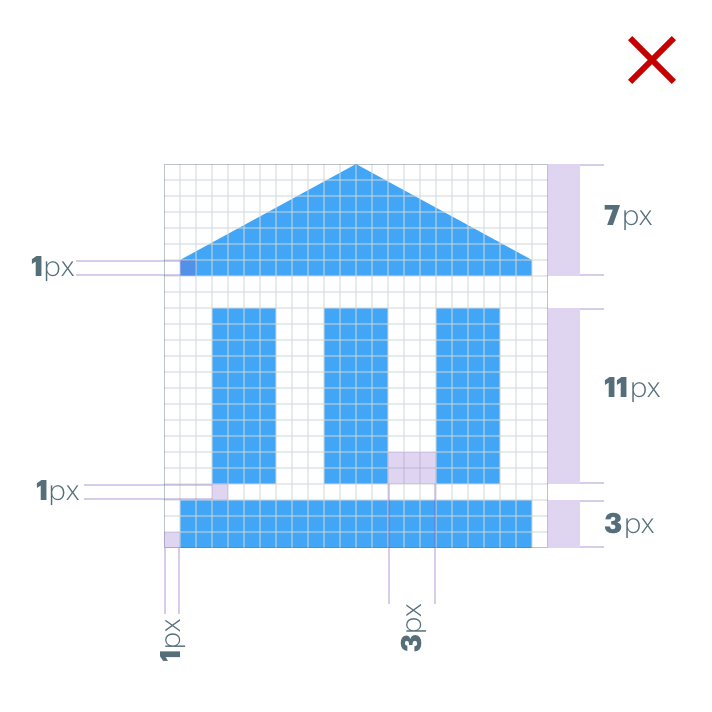
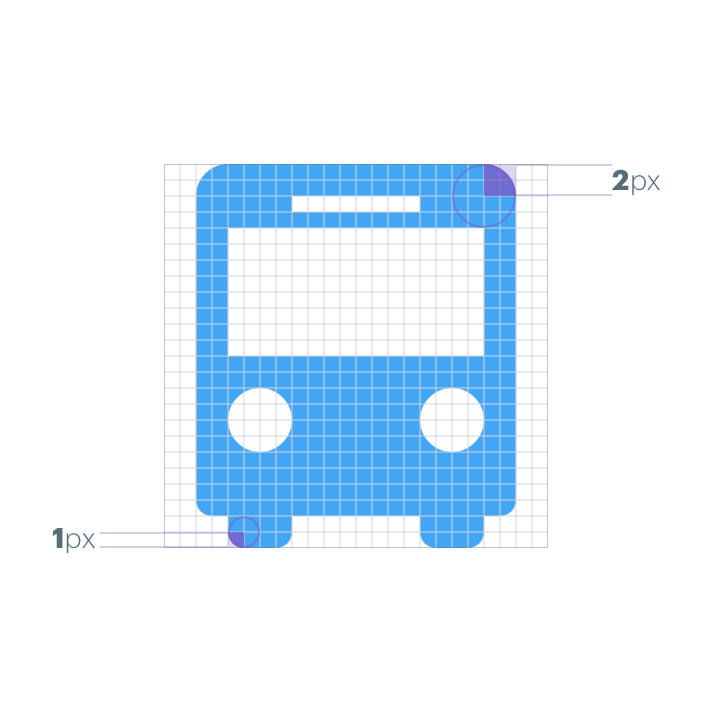
To ensure icons maintain alignment with the pixel grid at 24, 36 and 48px, it is important to use even numbers for both the position, width and height of shapes (positive and negative).
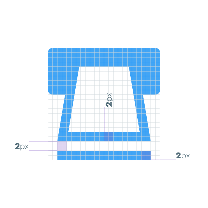
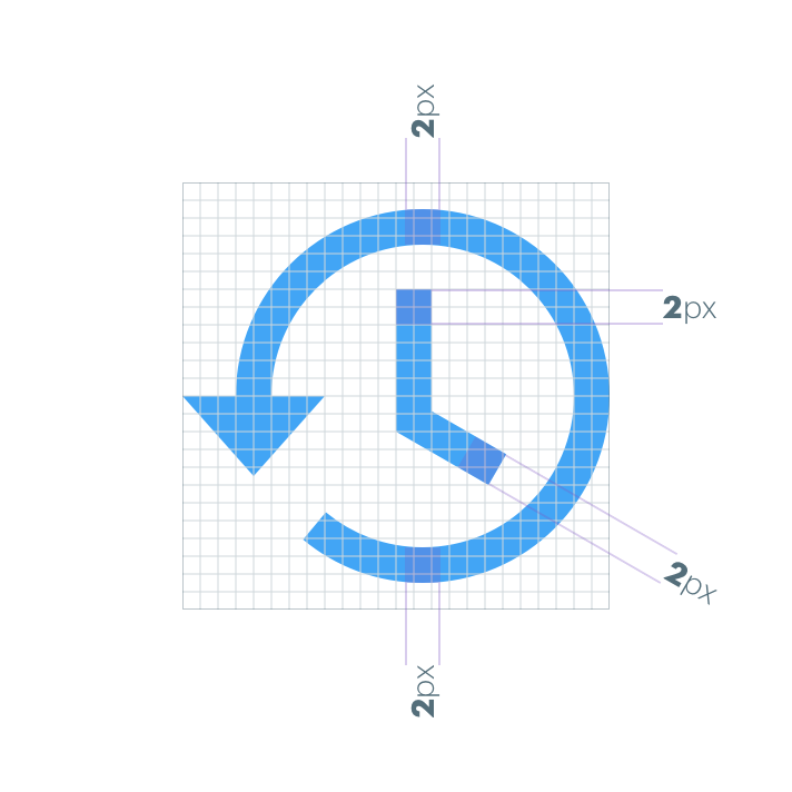
Corners
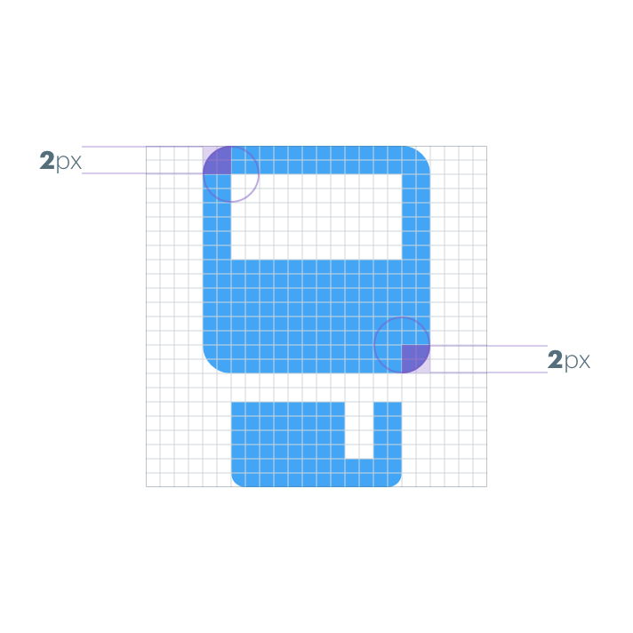
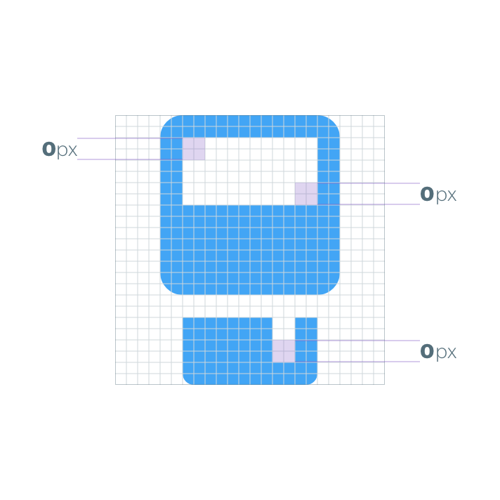
A 2px corner radius is used on the fill area of the icon. Interior corners in the counter area should always be square. Do not round the corners of strokes that are 2px wide or less.
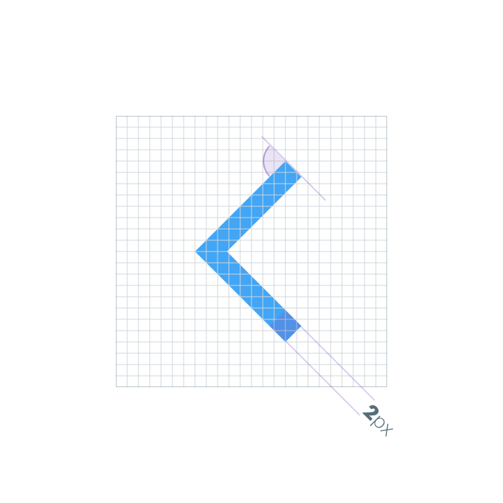
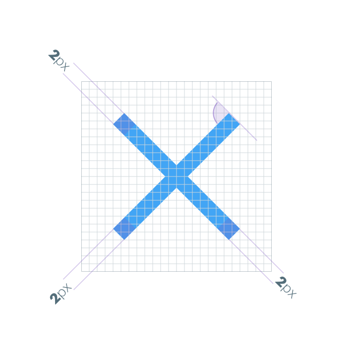
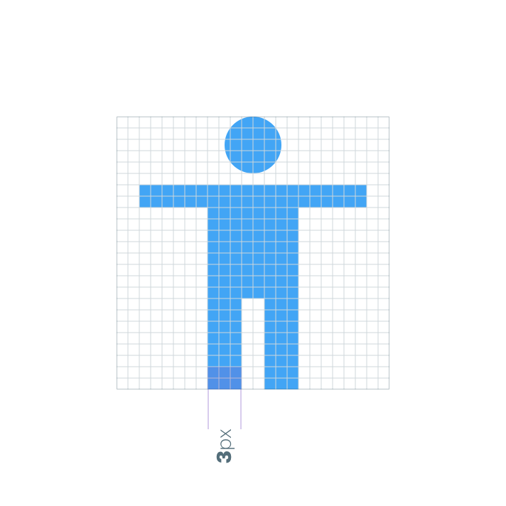
Strokes
Always use a 2px width for strokes and counter strokes. This includes curves and angles, interior and exterior.
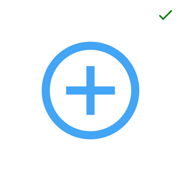
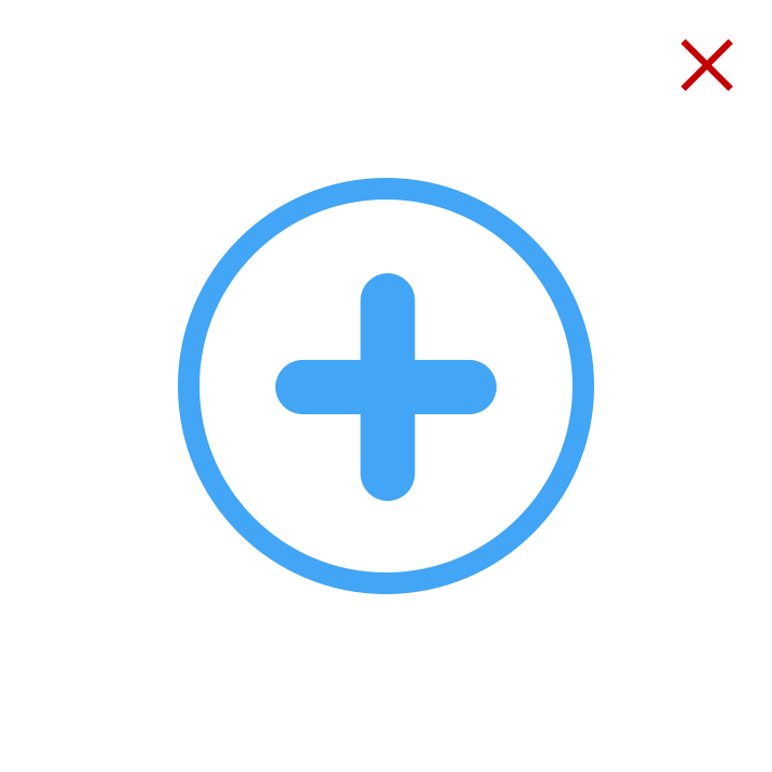
Artistic licence
Some scenarios may call for a little ‘artistic licence’ to break these guidelines to aid legibility of an icon. In spite of this it remains important to only use the consistent geometric forms on which all other icons are based. Don’t skew or distort the forms.
Best practice
Consistency aids user comprehension of icons. Use the existing system icons whenever possible and across different applications. If you have to create additional icons for your project here are some dos and don’ts.


SVG icons
With the release of the GEL Design System v2.0 we superseded the icon font in favour of an SVG (scalable vector graphics) implementation. Using SVGs ensures the highest quality rendering on all devices both now and into the future. SVGs can also be styled using code avoiding the need for multiple versions of the same icon. SVGs also comply with AA accessibility requirements. This is a more flexible and accessible approach. For more technical information (embedding, styling, sizing etc) and to download the SVG icons please refer to the Design System Iconography.