The Grid
Justin Spencer
In recent years we’ve seen a fundamental shift in the hardware our customers use to access information and services online. New devices are being introduced every day. These devices come in a plethora of different screen sizes and resolutions. We can’t keep creating custom solutions for every device on the market. What do we do?
Responsive design
Responsive design suggests that a single user interface should respond to the screen size and orientation of the user’s device, by expanding, contracting and re-ordering the elements on the screen. This practice consists of a mix of flexible grids and CSS media queries or more specifically ‘breakpoints’.
Some designers find the responsive grid difficult to get to grips with especially if they’re not familiar with HTML and CSS. In this article we’ll explain how the grid works and how it will help you design responsive web sites and applications. We’re only going to cover the basics, when you’re comfortable with this the best way to learn more is roll up your sleeves and get stuck in.
Yeah but how wide is it?
The first hurdle in responsive design is to accept that you never know the exact width of the browser window (viewport). You’re no longer dealing with specific pixel widths, rather the width of an element is dictated by how many columns it spans. Each breakpoint gives you the opportunity to change the number of columns an element spans (amongst other things). Note: you can still use fixed width elements within your design but you’ll need to keep an eye on what happens to these elements at different viewport sizes.
Breakpoints
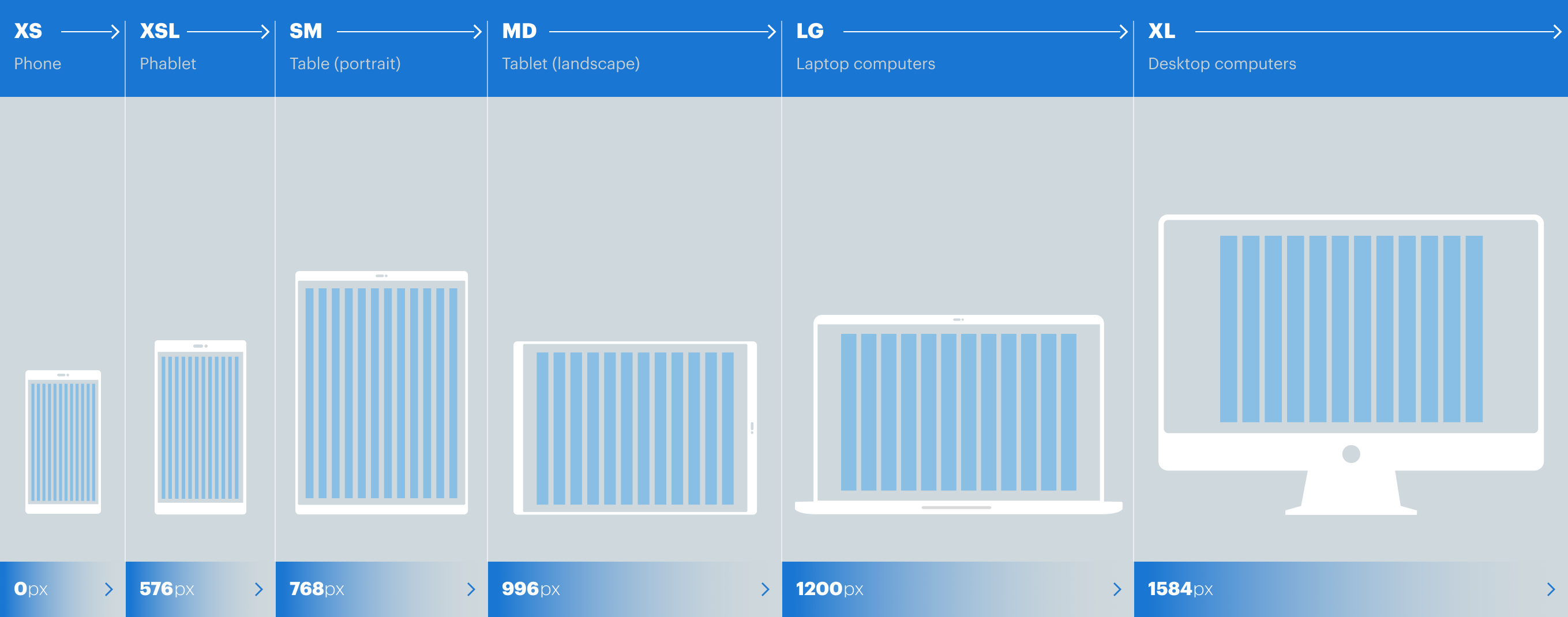
A ‘breakpoint’ is a predefined viewport width. The Design System utilises 6 breakpoints. At each breakpoint we have the option to make adjustments to the interface design or layout using CSS. For example, we can adjust how many columns an element should span, the size of the text, its colour, visibility etc.
This is how we define each of the 5 breakpoints:
As shown in the graphic above it’s important to understand that a breakpoint indicates a range value. For example, if you set an element to span 12 columns in XS view this will remain the case while the viewport is between 0px and 575px wide. Once the viewport has reached the XSL breakpoint you have the option to change how many columns your element spans (amongst other things).
Columns
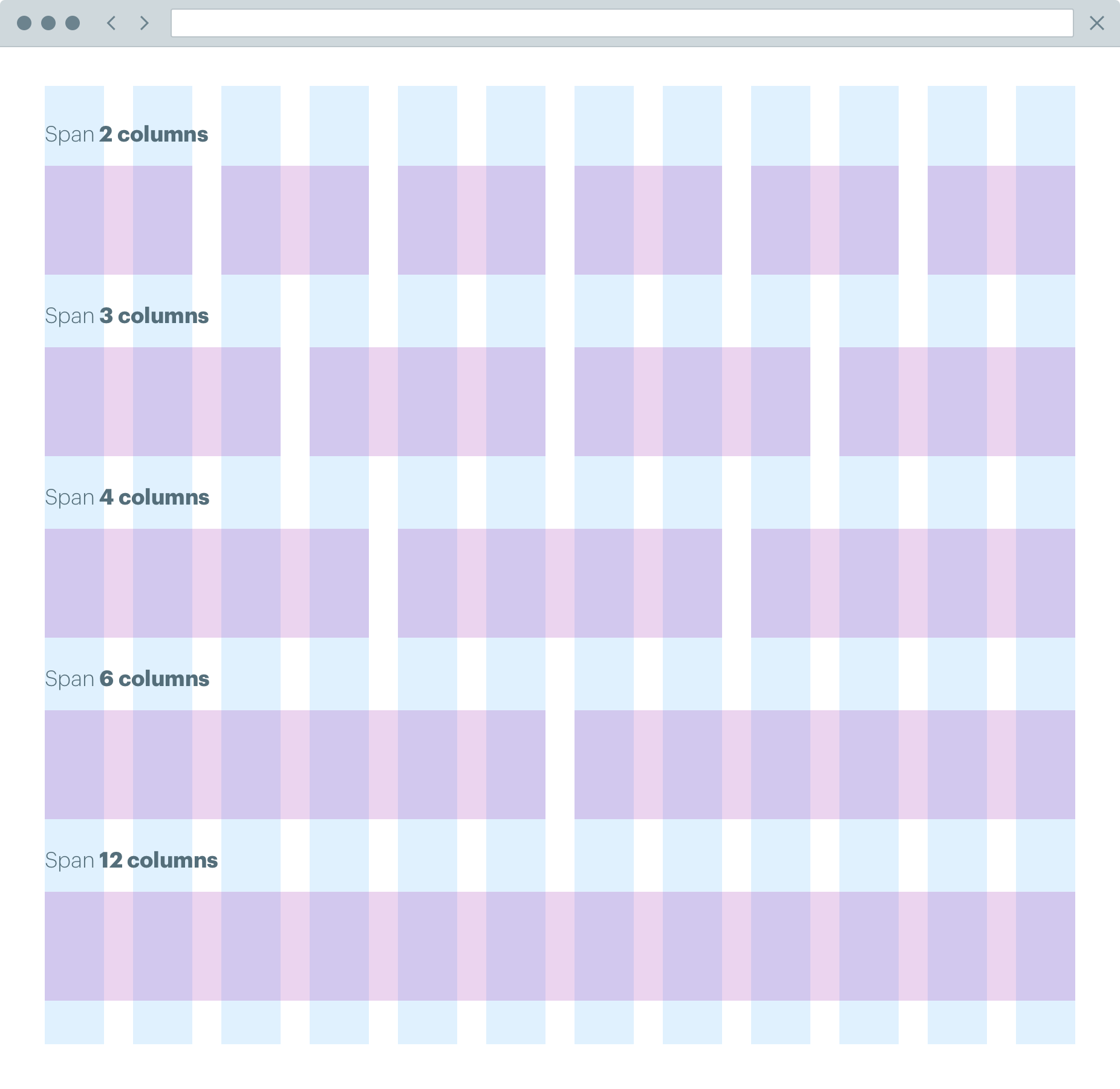
The grid consists of 12 columns (see figure 1). A pre-defined gutter is applied to separate each column. Column widths are defined using a percentage value, this approach is commonly referred to as a “fluid grid”. Using a fluid grid allows us to utilise all available real estate at any viewport size. At each breakpoint we have the opportunity to adjust how content is displayed in the grid.
As illustrated in figure 1. the number 12 is an extremely versatile composite number not least because it has 6 divisors - 1, 2, 3, 4 and 6. This versatility offers much more flexibility for layout options which is particularly useful when designing responsive applications.
Column spans
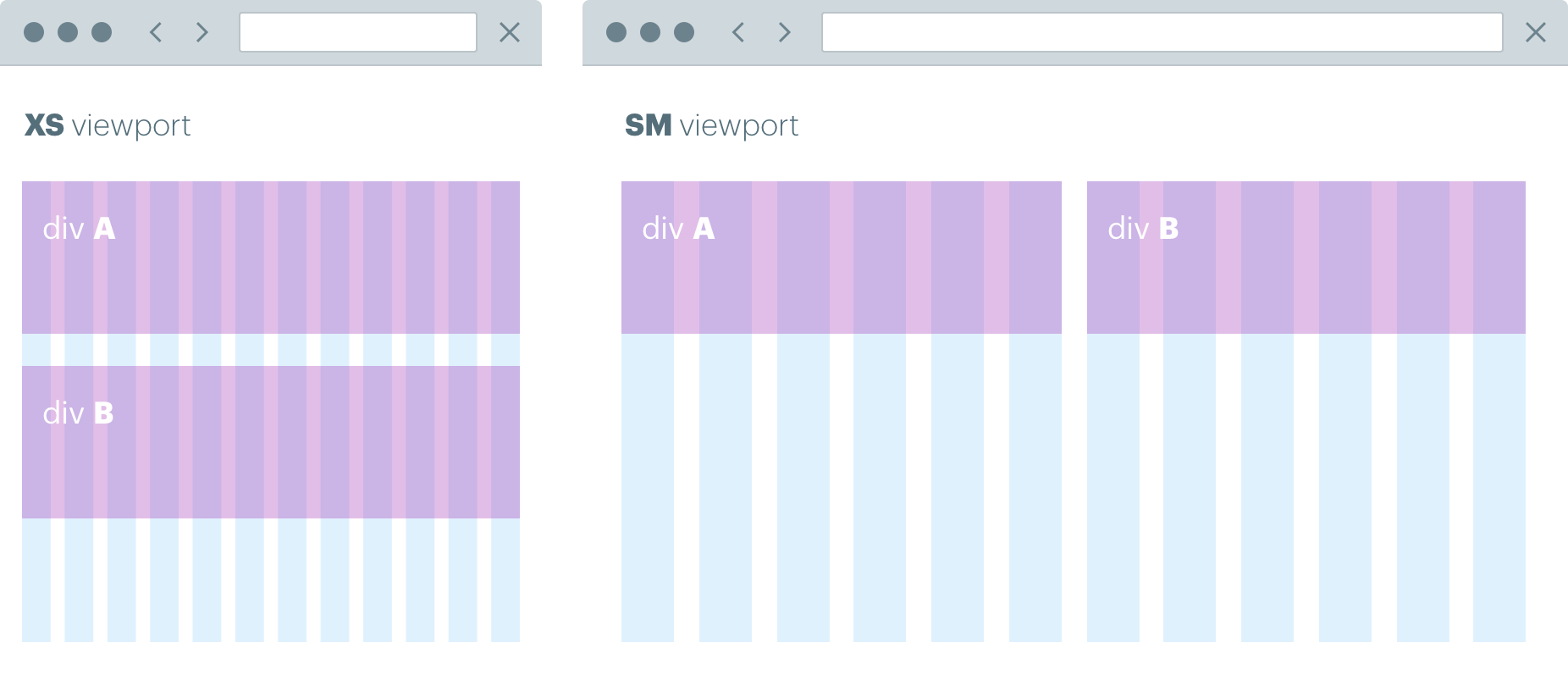
When we design our layouts in a responsive environment we don’t use fixed pixel widths instead we use column spans and offsets. Rather than specifying the width of an element in pixels we specify the number of columns the element needs to span. We can then change the number of columns that element spans at different breakpoints. For example, suppose we have 2 elements A and B. In XS view we want A and B to each span 12 columns. This results in A and B stacking. However, on a larger viewport (e.g. SM) we don’t want A and B to stack instead we want to place them side by side. To achieve this, we would specify that A and B each span 6 columns at SM.
Column offsets
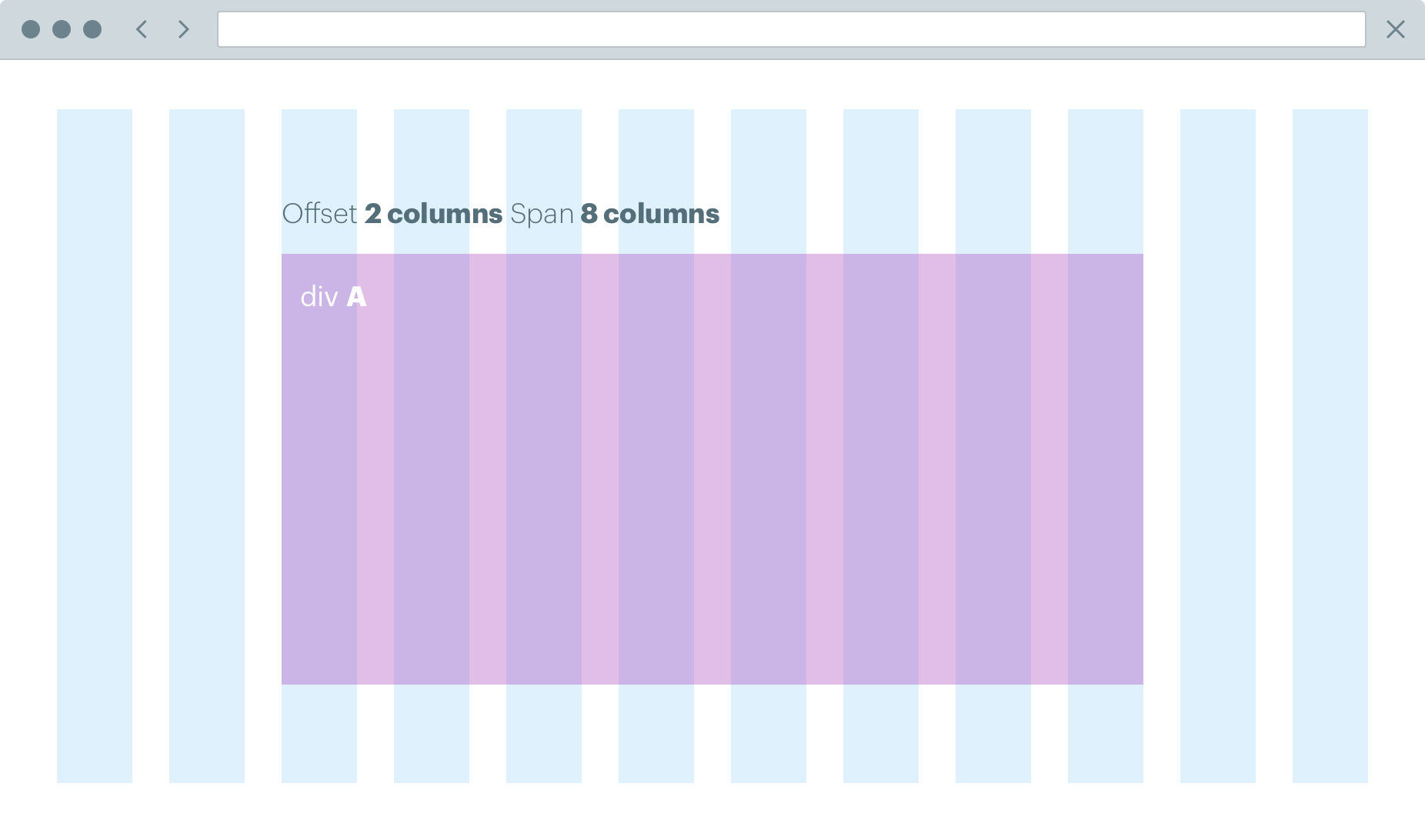
Column offsets work in tandem with column spans. They allow designers to move content across the grid. For example, a text element may not need to span 12 columns in LG view. To reduce the width of the text element the designer could offset 2 columns and span 8. This would provide a narrower text element. Offsets also allow us to create more interesting asymmetric layouts which don’t follow the popular blog style design approach where everything is centred.
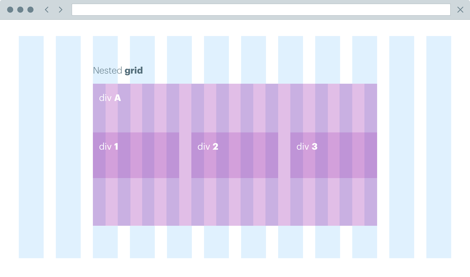
Nested grids
Nested grids offer even more flexibility for content layout. As the name suggests a nested grid is just another grid put into a container that’s already in the grid. There are 2 key things to remember when using nested grids. Whenever you add a grid it will always use 12 columns and there will always be the same margin between the columns no matter how small the container.
Design assets
The Figma Library provides templates showing the grid at all 5 breakpoints. These templates are a good starting point but while you’re designing bear in mind that the viewport could be anywhere between these sizes.
Collaboration
Responsive design is difficult. The days of doing a fixed width design and throwing it over the fence for build are long gone. Creating robust layouts that respond elegantly to any device requires real collaboration between both designer and developer. The designer isn’t going to visualise what happens to every element at every possible viewport. Some things will be missed; some things may not work as expected. Working with the developer these issues can be identified and fixed very quickly.
Frequently asked questions
Do I need to know HTML and CSS?
Not really but it certainly helps if you do. This article only covers the basic principles. The best way to get your head around the grid is to get stuck in and have a play.
Do I design mobile first?
When responsive design took off it quickly became apparent that designing mobile first was the best approach. Designing for the smallest viewport and working up would seem like the obvious thing to do. However, in our experience this approach also comes with drawbacks. Designers often focus too much on the mobile (XS view) and struggle to make their mobile designs work in the larger views. The same applies when designers focus too much on the desktop (LG view) then struggle to make the design work in smaller views. In reality when designing a responsive interface, designers should consider all breakpoints when making any design decision.
Do I design for every breakpoint?
This depends on your design. Complex layouts will require more rigorous design support. The more design you do upfront the fewer issues you’ll have in build. For large projects, we normally design re-usable components and provide component libraries where each component is designed at all 4 breakpoints. This allows developers to focus on building robust, responsive components that can then be assembled into templates.
Do I have to use the grid?
We recommend using the grid not just because it works well but also for consistency throughout the customer journey. Using the grid will help maintain consistent spacing, scale and rhythm across all our digital touch points. Using the grid also removes a lot of the potential cross browser bugs often encountered when designing responsive applications.
Can elements break out of the grid?
Yes, page furniture like headers, footers, navigation and background images often break out of the grid.
What about content?
You should definitely have an awareness of how your content will appear across all break points. However, designing a content strategy for your responsive design is a whole different topic and beyond the scope of this article.