Colour
Justin Spencer

Each brand within the Westpac Group uses a unique colour palette as part of its identity. These colours permeate every touchpoint in the customer journey. The correct application of these colours is critical to brand recognition and overall customer experience. When the palette is used incorrectly, brand integrity is diluted and the customer journey becomes fragmented. This article explains why we have a colour system, how it works, and how to apply it in your designs.
Why we have a colour system
Colour systems are now common practice; however, Westpac has a unique set of business requirements that shape how we design with colour.
How it works
The Colour system is a curated collection of carefully considered variables and tokens designed to work in unison.
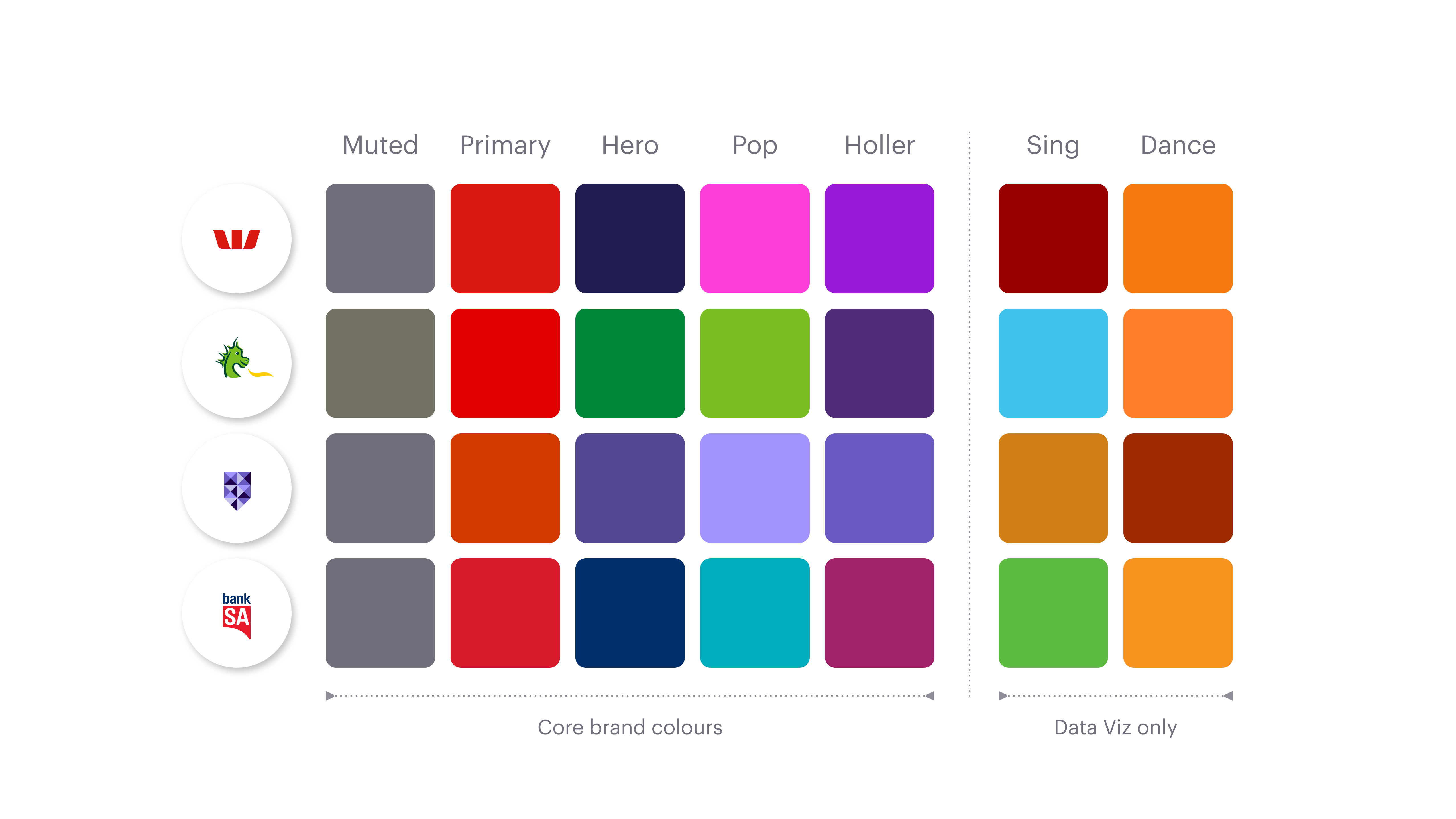
Core colours
In consultation with each brand we define a unique set of core colour values. These colours are carefully selected to ensure brand alignment and to guarantee accessibility in all required scenarios. Figure 1 shows the core brand colours for each brand.
Note: The last two colours (Sing and Dance) are strictly for Data Visualisation (charts and graphs). They must not be used for any other purpose.
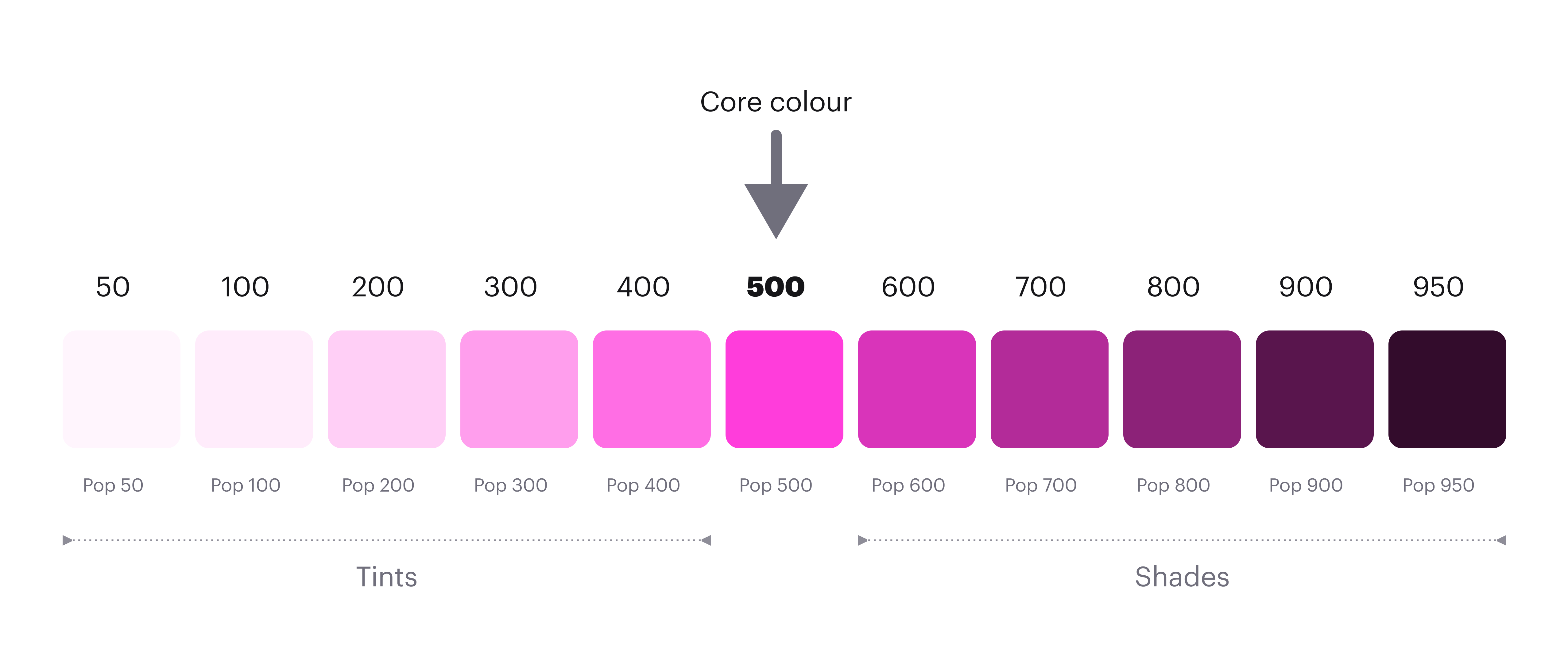
Colour ramp
When the core colours have been defined we create a colour ramp for each one. The main purpose of the ramp is to define corresponding values for dark mode. The core colour sits at the centre (500), with carefully selected tints and shades applied to either side. These values are then mapped to tokens and rigorously tested to ensure accessible contrast ratios can be achieved in both light and dark modes.
Colour tokens
The colour system is a curated set of semantically named tokens (for example, surface-primary, text-muted). Each colour token supports two modes: light and dark. Designers and developers use these tokens to design and build applications.
Scope
To simplify the design process, scope has been applied to each token. Scope restricts tokens to specific properties, allowing us to group them into three main categories:
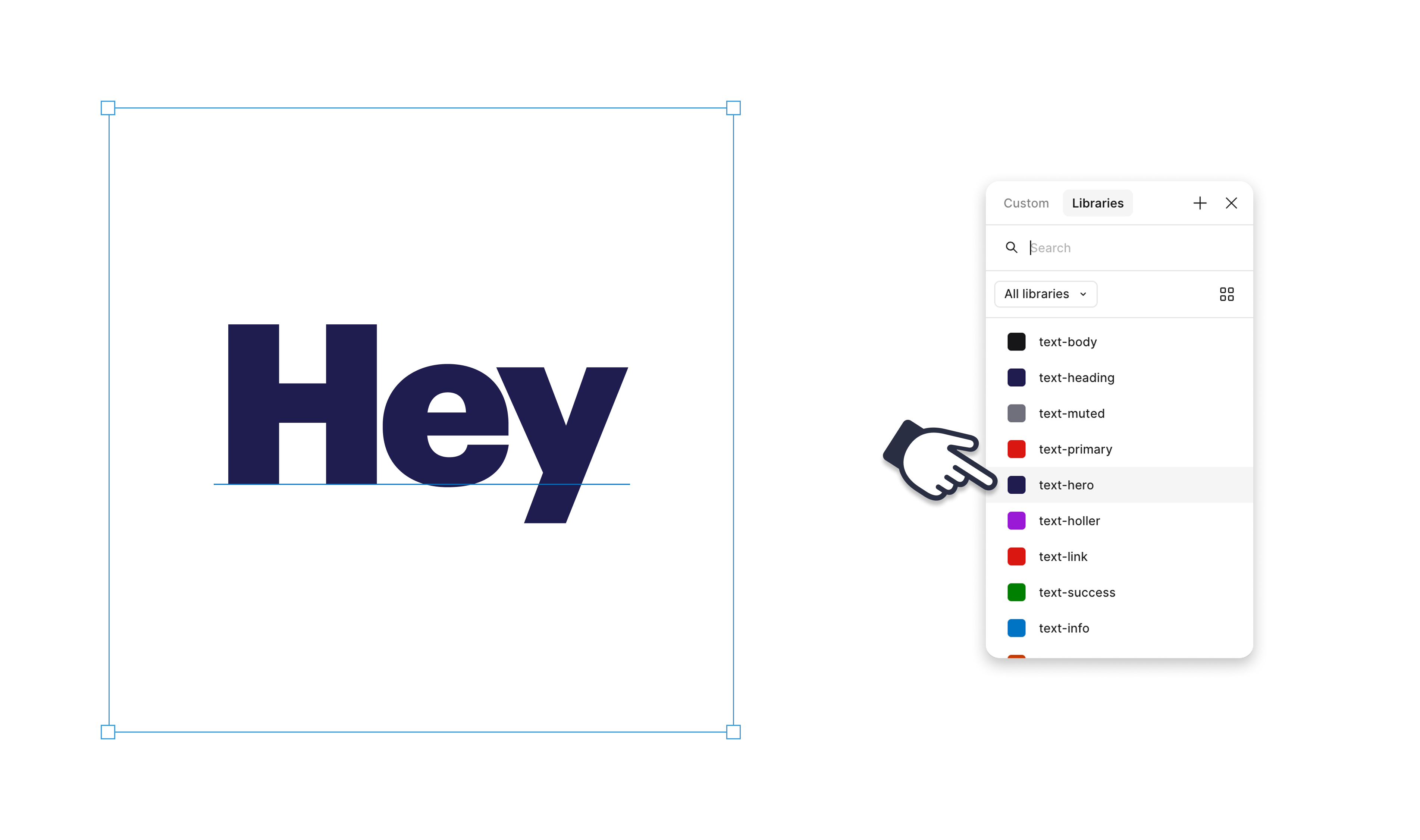
In figure 3 below, the text layer is selected so only the text colour tokens are available. Not only does this simplify the design process it also reduces margin for error and increases consistency.
Do and don’t
Designing with tokens will be an adjustment, allow time to familiarise yourself with the system.
Do use tokens
When designing or building the UI only use GEL colour tokens. Bespoke colours will not respond to mode switching which may introduce accessibility issues and inconsistency. This also applies to multi-brand applications which will also not respond to brand switching if bespoke colours are used.
Don’t re-design
It’s critical that we maintain a consistent customer journey across all our touch-points. The GEL colour tokens are designed to replicate our current design direction. There are minor colour refinements, but these should be visually insignificant. If tokens are applied correctly, your designs should not change.
Do follow the guides
The GEL Docs site includes a comprehensive list of colour tokens with strict usage guidance. Refer to this list while working. In Figma, you can also hover over a token name to view its usage guidance.
More information
The links below provide detailed, design principles and usage guidelines. Allow time to familiarise yourself with the system and always refer to the usage guidelines when applying tokens. If you have any questions please contact the GEL team.