Typography
Justin Spencer

There’s no disputing the power of typography. It has a huge influence on brand perception and recognition. Good typography not only differentiates a brand but also communicates the brand’s style, personality and tone of voice. This article explains how we use typography as part of our multi-brand system.
The typography system
The typography system allows each brand to designate two typefaces: A display font for headings etc. and a body font for editorial and UI elements. Similar to the colour system, a reference (variable) is created for each font; Brand and Body. By using this reference rather than the physical name of the font we can quickly and efficiently implement brand specific typography across multiple applications and brands.
The brand font
The brand font is a crucial part of the digital brand. Correct use of the brand font provides invaluable brand recognition, consistency and authenticity. Incorrect use of the brand font has the opposite effect.
To differentiate themselves brands typically choose (or create) unique typefaces. These are generally display faces, used for headlines and marketing messages etc. They may also include multiple weights like bold, regular, light etc. We can not guarantee that brand fonts are installed on every users system. To get around this we provide a web version of the typeface. This is known as a web-font.
The body font
The body font is the companion to the brand font and used for all UI elements and body text. This typeface has to be extremely flexible and functional. As a result we encourage brands to use system fonts rather than bespoke web-fonts for the body. There are several key reasons we use system fonts for body text and UI elements:
The font stack
To implement fonts in our web sites and applications we use two CSS font stacks. One for the brand font and one for the body font. Put simply a font stack is a list of typefaces. When customers view a website or application their device goes through this list and selects the font best suited to the operating system.
The body font stack is a list of system fonts found in each operating system iOS, Android, Windows etc. When customers view a website or application their device goes through this list and selects the corresponding system font.
The brand font stack is also a list of typefaces with the web-font being the first entry and thus taking priority. All other fonts are simply backup system fonts in-case for some reason the web-font is not available.
Font weights
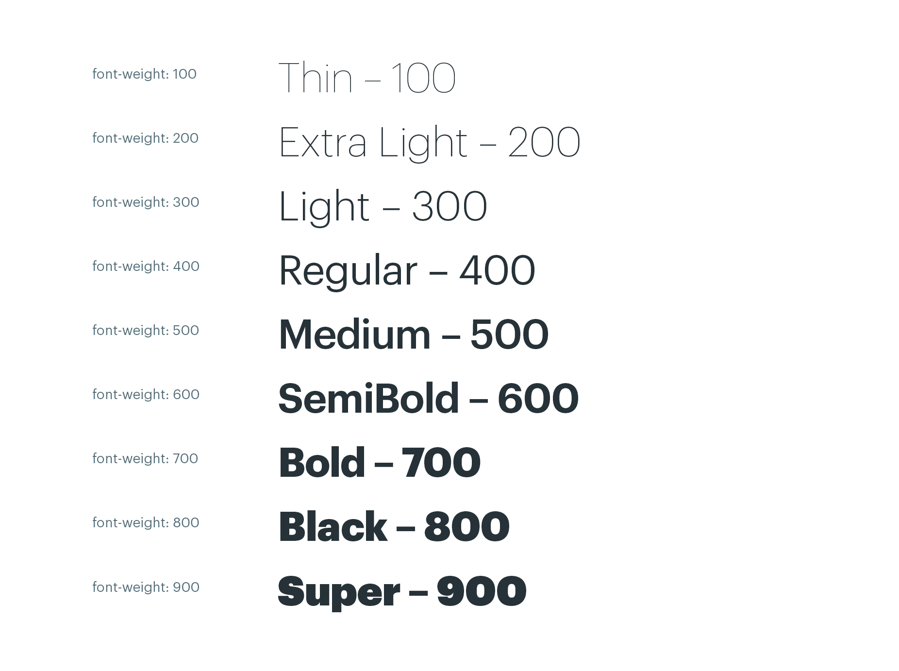
Font weights allow us to add more visual appeal and hierarchy to our designs. Designers can use the available weights as they see fit however they must consider the brands design direction and guidelines. As we use the font stack to establish the correct typeface developers must always use numerical values to assign different font weights rather than specifying the physical name or weight of the font. For example, assigning a value of 300 to the font weight property will display the light version of whatever typeface the device is using (providing this weight is available). Unavailable weights display the logically closest weight. Font weights should always be used in alignment with the GUIs and the digital brand guidelines.
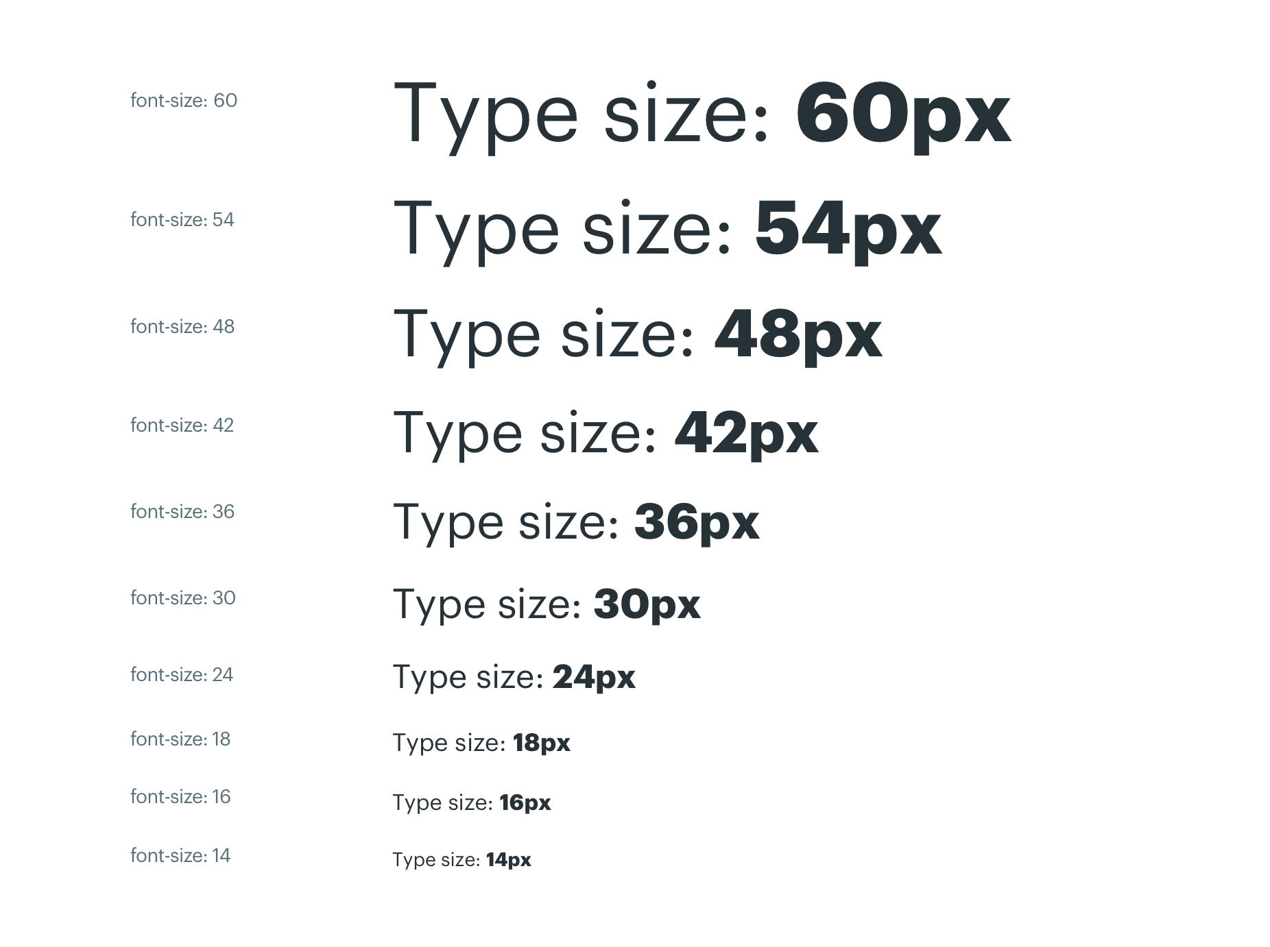
Type scale
Our typographic scale has a limited set of sizes that work together to help maintain a consistent scale and rhythm across all digital touch-points. Designers can use these sizes as they see fit however they must consider the brands design direction and guidelines. We also have a few practical rules around the use of type sizes.
We’re hoping to establish a more robust system of spacing for our Typography system however this is easier said than done due to the volume and variation of our digital products and services. We’re also aware that good typography is a craft not an exact science. Baseline grids, tracking, kerning, leading etc are all features used by designers to massage letters and words into visually appealing shapes. With this in mind we are reluctant to apply too many rules to the type system opting instead to let designers work their magic armed with their knowledge, experience and of course the brand guidelines.