Checkboxes are a proven and effective way to elicit a multiple choice from a user. They also require careful consideration to produce the best results.
Sizes
There are two checkbox sizes, make sure when laying out forms that your checkbox size and field sizes are aligned.
Hint text
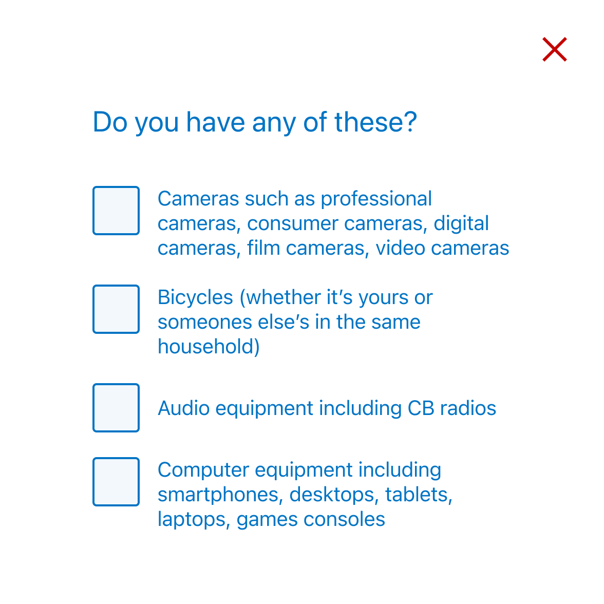
This variation allows supporting text to be displayed below the selectable item. For use in scenarios where the options are complex and require further information for clarity, using the hint text prevents the labels becoming too long which can effect scanability. Hint text can be used with both Medium and Large sized checkboxes.
Reveal
When requirements dictate long lists of choices, and particularly as mobile screens can only show a limited amount of information at a time, it's possible to surface the most common choices, and hide the rest under a "reveal" interaction. Once the user selects the toggle, the remaining items reveal and the toggle disappears.
- Avoid hiding one or two options under the toggle as this forces the user to interact with the interface for very little value.
- Use data to inform your decisions on which options are surfaced at the screen level.
- Surface the most popular and hide the rest behind the interaction.
- Always express how many items are behind the reveal.
- Reveal can be used with both Medium and Large sized checkboxes.
Horizontal layout
Use this option when you require an inline layout, it's only recommended in very specific circumstances and we suggest never having more than two checkboxes side-by-side.
Error state
All form elements have associated error states, see Error messages in our content guidelines for more.
User experience
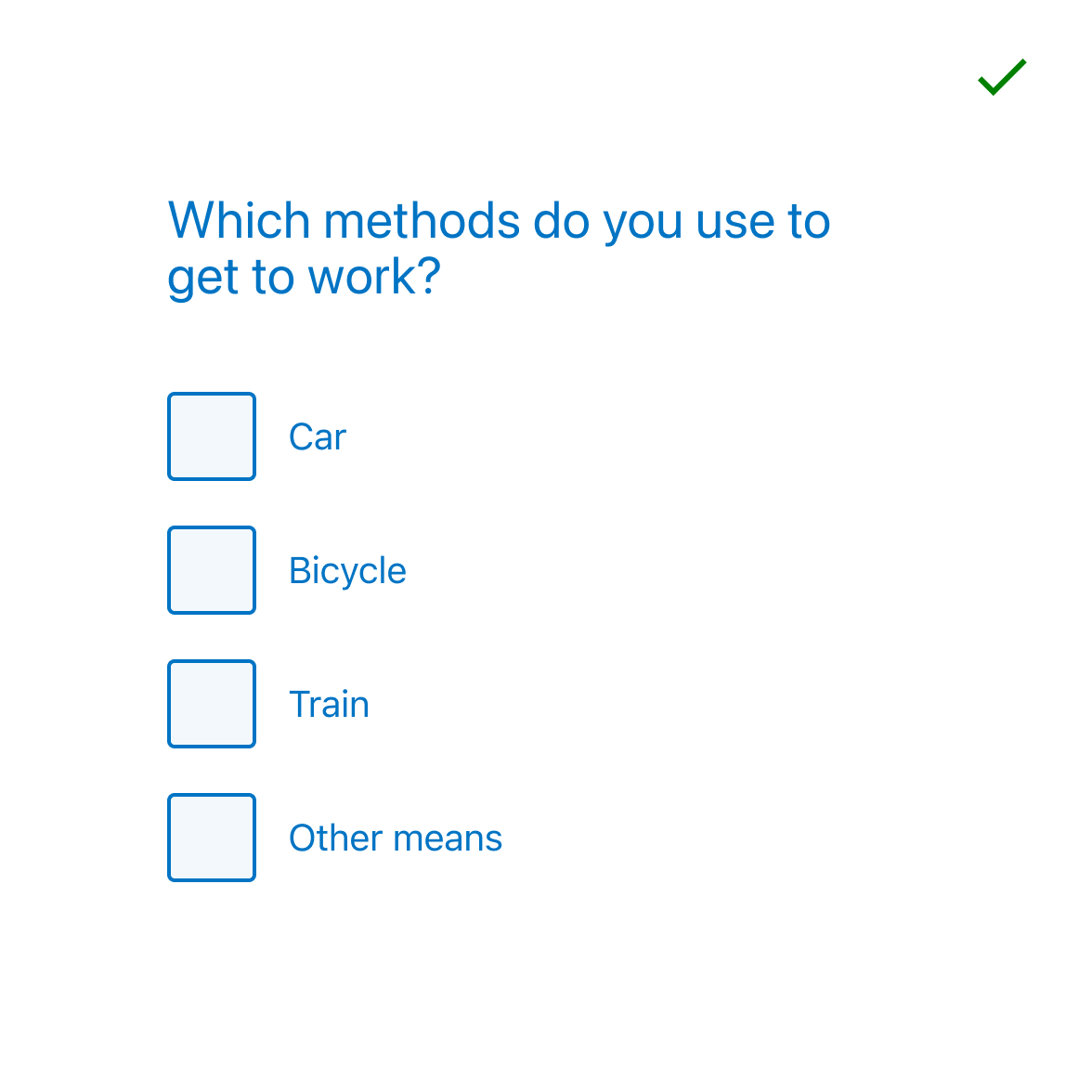
If you are asking your user to select one or more options from a list, then Checkboxes are the way to go. A single checkbox can also be used in isolation usually to acknowledge consent, understanding or agreement e.g Terms and conditions.
Keep elements close to each other for maximum performance as illustrated below:
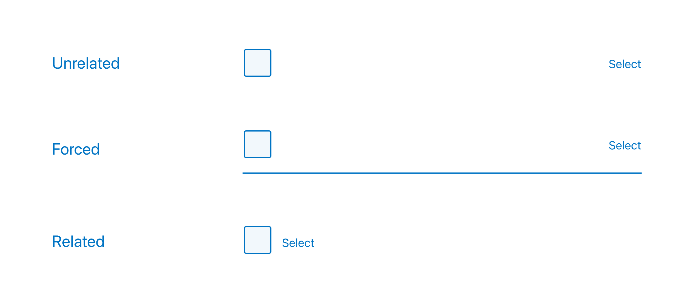
The closer the label to the input, the better.
Unrelated
There is little association between the input (checkbox) and label 'Select'.
Forced
Using the Gestalt principle of continuity, by adding a line between the input and the label, we are guiding the eye along the line and connecting the two.
Related
When a label sits next to an input the association is strongest.
Visual design
Most operating systems provide default styling for common UI elements such as checkbox groups. We've overridden this default styling for several reasons:
- The default styling does not align with our brands look and feel.
- The default styling often fails accessibility requirements such as colour contrast ratio and hit area.
- The default styling is proportionately not aligned with the other UI elements.
These issues have been addressed with the styling of the checkbox groups while making them more accessible, more consistent, more tactile and more visually appealing. These overrides also ensure that the radio and checkbox components will adapt automatically when building multi-brand applications.
Dos and don’ts
- Avoid placing more than two radios or checkboxes horizontally, side-by-side.
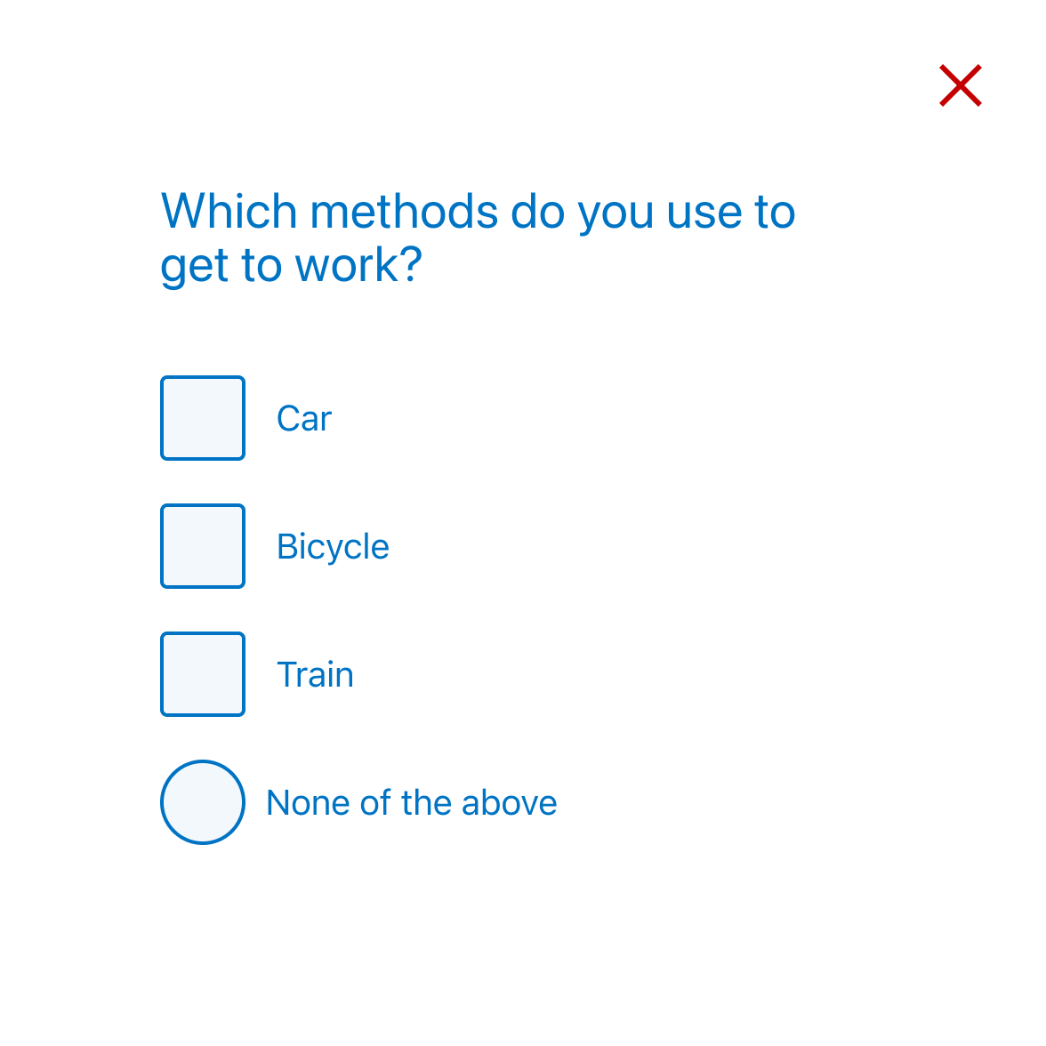
- Don't mix checkboxes and radios
- Avoid changing the colour of the checkbox symbol.
- Avoid changing the text styling of the checkbox label (size, colour etc).
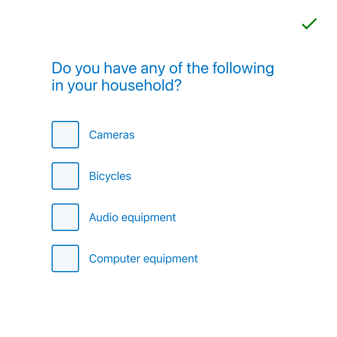
- Do make sure the taxonomy of the options you are offering makes sense as any ambiguity will only slow down or confuse the user.