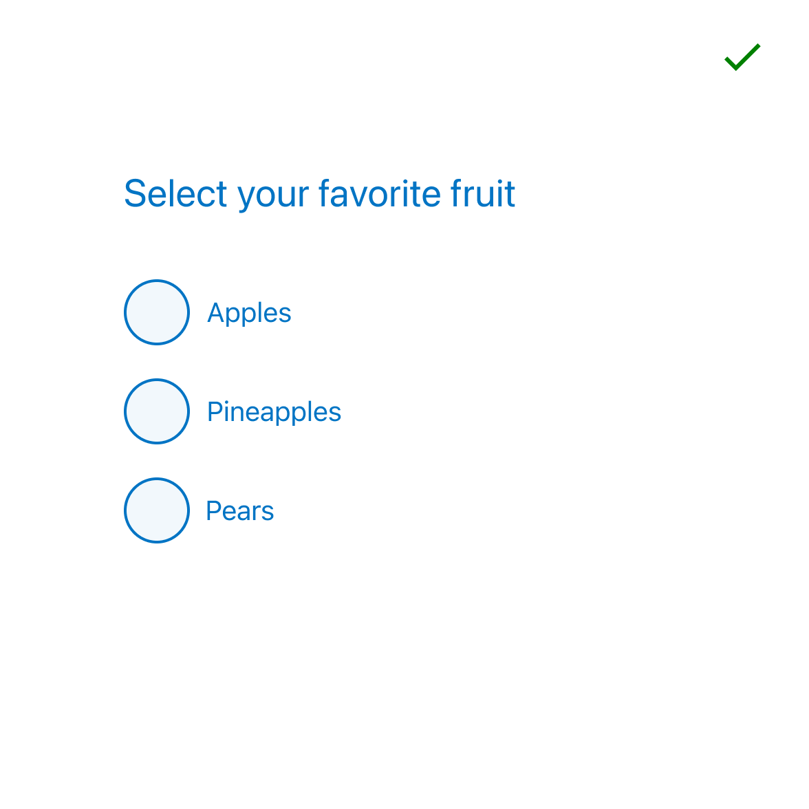
Radios are a proven and effective way to elicit a single choice from a user. They also require careful consideration to produce the best results.
Sizes
There are two radio sizes, make sure when laying out forms that your radio size and field sizes are aligned.
Hint text
This variation allows supporting text to be displayed below the selectable item. For use in scenarios where the options are complex and require further information for clarity, using the hint text prevents the labels becoming too long which can effect scanability. Hint text can be used with both Medium and Large sized radios.
Reveal
The radio component has the ability to hide a configurable portion of the options presented to the user. This is useful for when business requirements dictate that long lists of options must be presented to the customer.
- Avoid hiding one or two options under the toggle as this forces the user to interact with the interface for very little value.
- Use data to inform your decisions on which options are surfaced at the screen level.
- Surface the most popular and hide the rest behind the interaction.
- Always express how many items are behind the reveal.
- Reveal can be used with both Medium and Large sized radios.
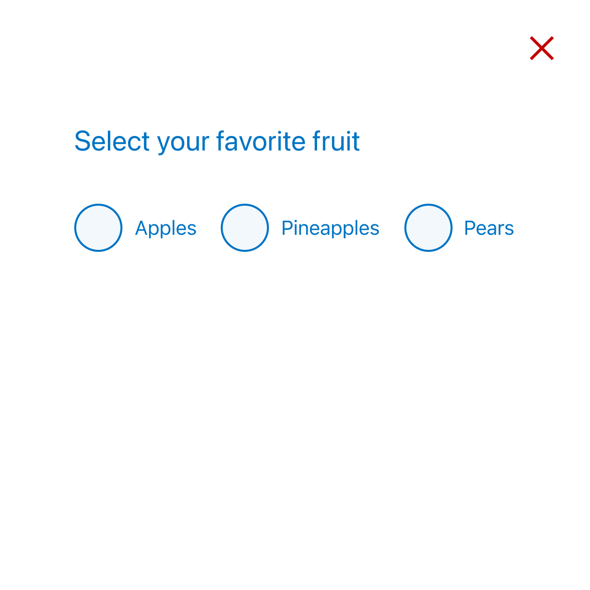
Horizontal layout
Use this option when you require an inline layout, it's only recommended in very specific circumstances and we suggest never having more than two radio buttons side-by-side.
Error state
All form elements have associated error states, see Error messages in our content guidelines for more.
User experience
Radios should be used when asking a user to select only one item from a list. They have a mutually exclusive, toggle functionality. Once a radio list has had an item selected, it cannot go back to having none selected, so if you need the user to acknowledge a non-selection it is best to include an option like ‘None of these’ in the list.
For simple yes/no questions, a possible alternative to a radio list could be a Button Group.
Default selections
Radios traditionally have one option selected as this mirrors the metaphor of how an analog radio (and indeed digital) radio works. The metaphor appears to have lost its etymological roots today, and there are a couple of competing principles at play when considering whether or not to set a radio active by default:
Reasons against
- By having an option preselected, it appears as though it has been answered, taking on the properties similar to that of placeholder text. When combining this with pre-populated inputs, it only worsens as behavioural assumptions about completion take over. The result is a form which may require clarification or correction at a later date, or give unintended results.
- By having a choice selected by default, the user is not taking conscious action to confirm their choice. While this isn't critical, in applications with severe legal consequences, it should be considered.
Reasons for
- By using data, we can understand which choices most users will make, therefore expediting form completion by using the most popular answer as a default, increasing the likelihood of faster completion.
- When integrating high quality data from a database we can pre-populate a form based on what we know about a user, potentially increasing the speed of completion.
While we err on the side of leaving radios unanswered, it is up to each team to decide which path is right for their application.
Visual design
Most operating systems provide default styling for common UI elements such as radio groups. We've overridden this default styling for several reasons:
- The default styling does not align with our brands look and feel.
- The default styling often fails accessibility requirements such as colour contrast ratio and hit area.
- The default styling is proportionately not aligned with the other UI elements.
These issues have been addressed with the styling of the radio groups while making them more accessible, more consistent, more tactile and more visually appealing. These overrides also ensure that the radio components will adapt automatically when building multi-brand applications.
Dos and don’ts
- Avoid placing more than two radios horizontally, side-by-side.
- Don't mix checkboxes and radios
- Avoid changing the colour of the radio symbol.
- Avoid changing the text styling of the radio label (size, colour etc).
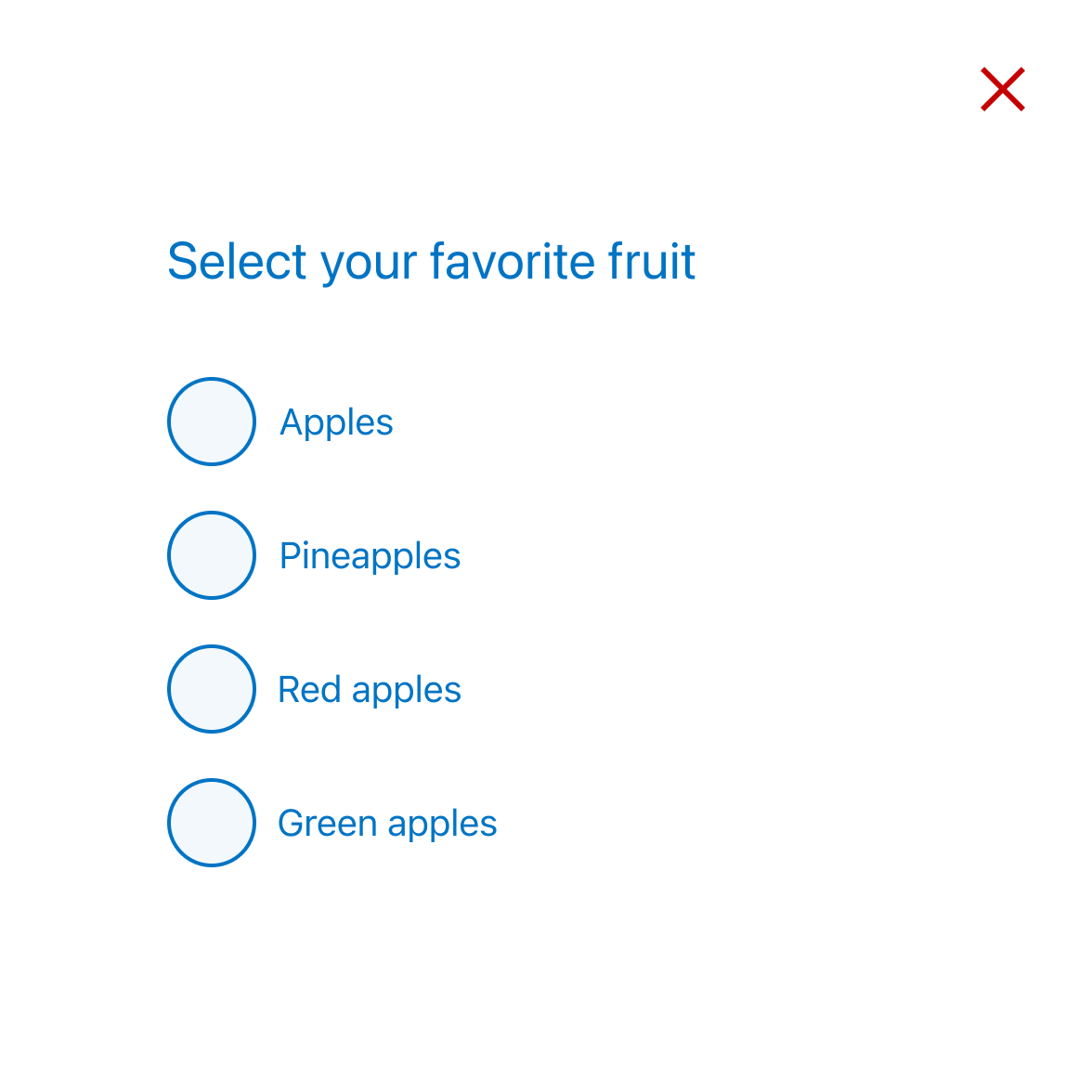
- Do make sure the taxonomy of the options you are offering makes sense as any ambiguity will only slow down or confuse the user.