Inputs are used to capture words or numerical data. They are predominantly used in forms and search tools allowing users to submit information.
Inputs with labels
Use the Input group component to accessibly define the labels used with Inputs, and Text areas. All inputs require labels for usability and accessibility.
Sizes
Text inputs come in four different sizes (heights) with the default being Medium 36px. Ensure when you are designing forms that you alway use the same size across element types.
Fixed widths
Use fix width inputs to help indicate the length of the data required. For example, if you are asking for a Postcode use an input with a width of 4 (i.e. 4 characters), this type of affordance helps with scanning and supports quick and easy form completion. The input widths are calculated to fit the respective number capital W's - the widest character.
Error state
All form elements have associated error states, see Error messages in our content guidelines for more.
User experience
In order to be most effective, form inputs must focus on usability and accessibility above all else. Like every component in this system, our design decisions are driven by what will provide the most robust solution across all scenarios.
Borders
We use a solid border as it is simple and universally understood. Using single lines as an input 'field' undermines the integrity of the affordance making it difficult to recognise. These fields can be easily confused with horizontal rules, that are often used in design to denote a break in content or a new section. Replacing the border also affects those with low vision (see the Text Inputs accessibility tab for more).
Placeholder text
We don't use placeholder text for a few reasons. Placeholder text needs to be visually very different from the text that gets entered into the field by the user, otherwise it appears as though the field has already been completed, causing the user to unintentionally skip it. Finding a colour that is different enough from ‘entered text’ colour, but still meets accessibility contrast requirements is incredibly difficult.
As placeholder text disappears once the field is in focus, it also places increased cognitive load on the user, requiring them to recall the instructions once they've gone.
Labels
We don't use floating labels. Floating labels often start off as placeholder text so inherit some of those issues described above. Additionally floating labels come with restrictions on label length (when a label is longer than the input field), hint text location challenges, and consistency with error validation.
Hint text and error messages
We do place hint text and errors messages directly under the input label for context. This approach also guarantees that on mobile devices, the hint text or error message remains visible and is not hidden by activated select boxes or keypads.
Layout
These components are designed to be stacked and do not work so well in column based executions as long wrapping labels, and hint text length can create misalignment when fields are horizontally laid out.
Visual design
Most operating systems provide default styling for common UI elements such as input fields. We've overridden this default styling for several reasons:
- The default styling does not align with our brands look and feel.
- The default styling often fails accessibility requirements such as colour contrast ratio for borders and placeholder text.
- The default styling is proportionately not aligned with the other UI elements.
- The default styling often looks dated and poorly rendered.
We’ve addressed all these issues in the styling of our input fields making them simpler, more accessible, more consistent and more functional.
We’ve also provided several sizes (heights) to accommodate different layout scenarios and styled the tab focus state to better align with the brand.
These overrides ensure that all input field components will adapt automatically when building multi-brand applications.
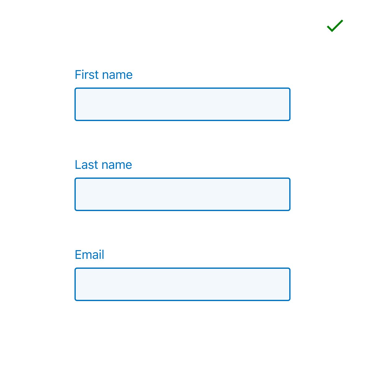
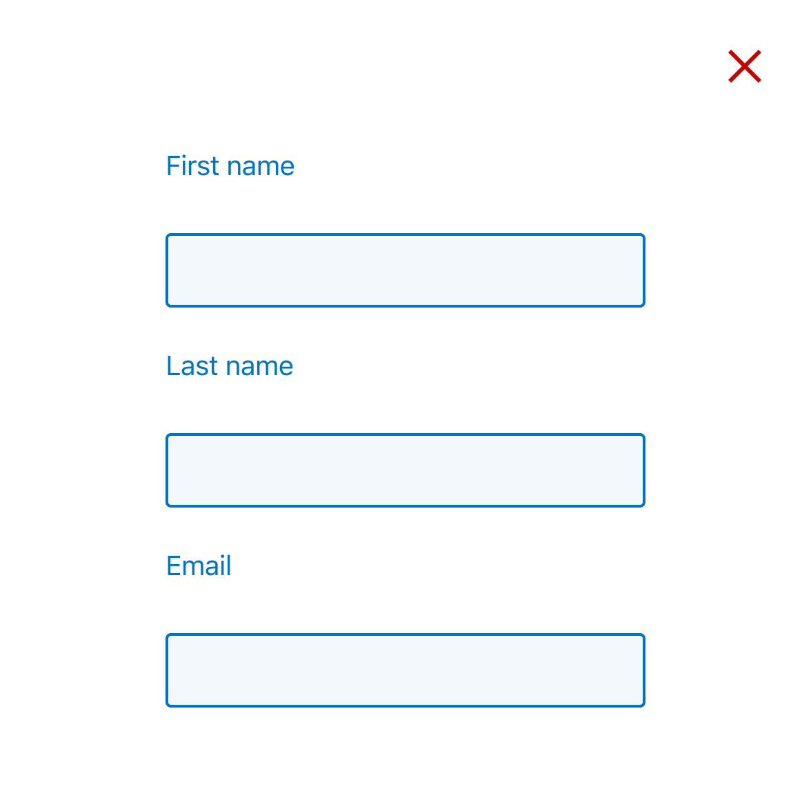
Dos and don’ts
- Do use any of the predefined input sizes but make sure to use the corresponding button size if required.
- Do keep labels in close proximity above the input field.