Buttons are elements capable of performing an action. They have a variety of uses and require careful consideration for consistency, hierarchy, brand, and accessibility.
Button sizes
Buttons come in four different sizes, corresponding to the sizes of other form elements. By default, a button's width is determined by the width of its internal label. Alternatively, it can be configured to span the full width of its container, as demonstrated with block buttons below.
Button styles
Standard buttons: There are three standard button styles you can use in your interface.
Soft buttons: The soft button option places less visual emphasis on the button. Soft buttons are useful when grouping buttons with differing importance.
Buttons with icons: Using icons in buttons is especially useful for indicating a button's functionality. Icons are a universal language - the 'Search icon' will almost always mean search.
Responsive buttons
Responsive buttons can change appearance based on breakpoint. For example, the buttons can change size or become block or inline. This feature is often used at the XS breakpoint (generally for mobile devices). The example descriptions below assume the button is first viewed at XS, resize your browser to see them change.
User experience
It’s important to consider the right button style, size, and configuration for the job or device at hand. Be careful not to overuse primary buttons on a single page or screen as this dilutes the impact of having a primary button in the first place. This becomes critical for e-commerce and form related experiences.
It is usually easy to define the primary action for a page, for this you would obviously use a standard primary button style. However, be sure to think about any secondary or tertiary actions you might want the user to perform, and choose appropriate styles from the other options available: Hero, Faint or one of the soft button styles.
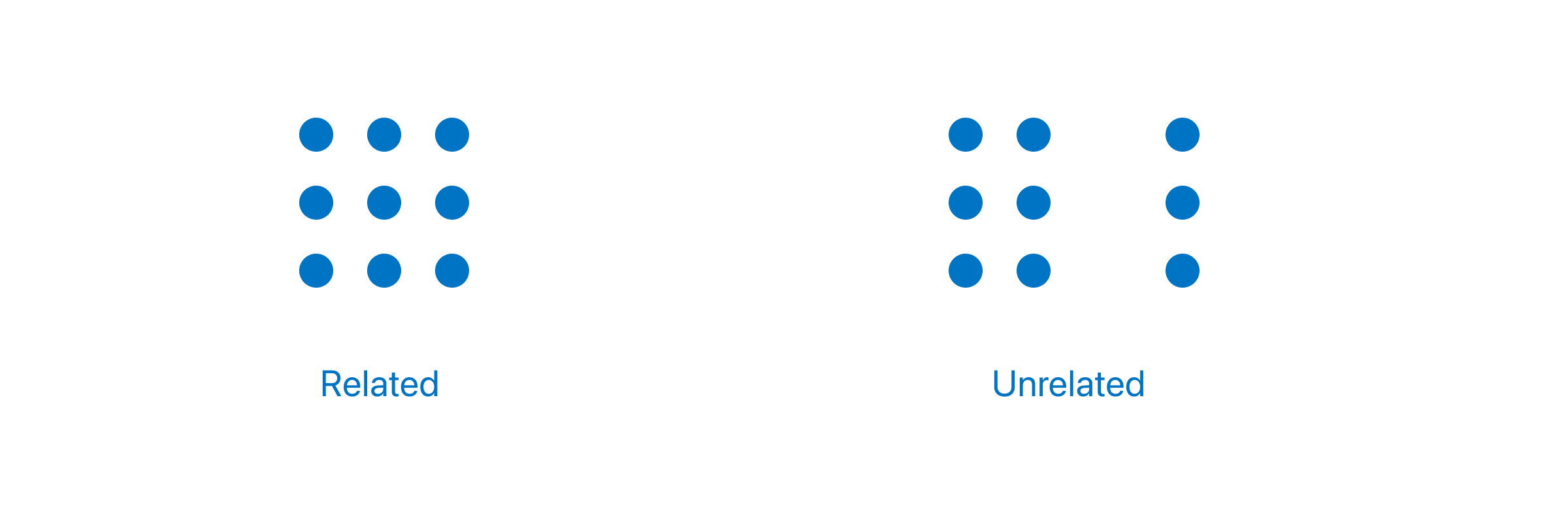
Make sure buttons are an appropriate distance to the corresponding object or function, so they appear related. The Law of Proximity is the gestalt grouping law that states: elements that are close together tend to be perceived as a unified group.
Visual design
The button system gives you the flexibility to choose from multiple styles, sizes and configurations depending on your needs. The system uses the brand colour palette to establish a consistent, logical hierarchy. This is particularly useful when the interface contains several actions which may vary in importance. From a visual design perspective buttons add clear delineation which aids legibility when the interface becomes complex or content heavy. Buttons also provide an opportunity to add some colour to the interface increasing brand recognition and freshening the overall look. Buttons are rectangular as opposed to lozenge in order to maximise the available width. This provides more flexibility with labels and button widths.
Dos and don’ts
- Do use multiple styles in the same interface if required.
- Don’t alter the button styles e.g. border radius, button height, font size, etc.
- Do make sure that the button height matches the form input height.
- Do keep text labels short.
- Avoid text labels that wrap onto 2 lines.
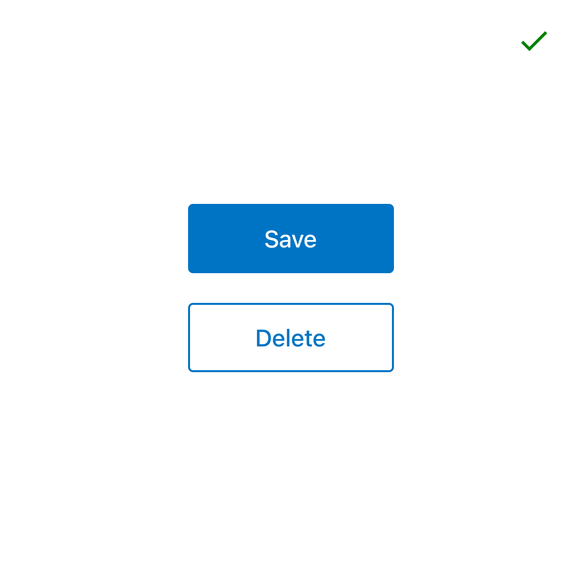
- Avoid disabled buttons where possible - users may not know why a function is disabled as there is no feedback offered.
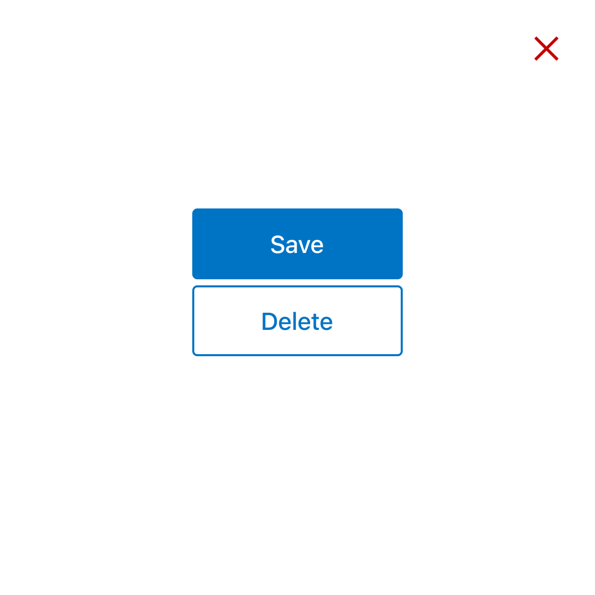
- Avoid placing critical functions next to one another to avoid errors and loss of data or accidental processes.