Data visualisation
Justin Spencer
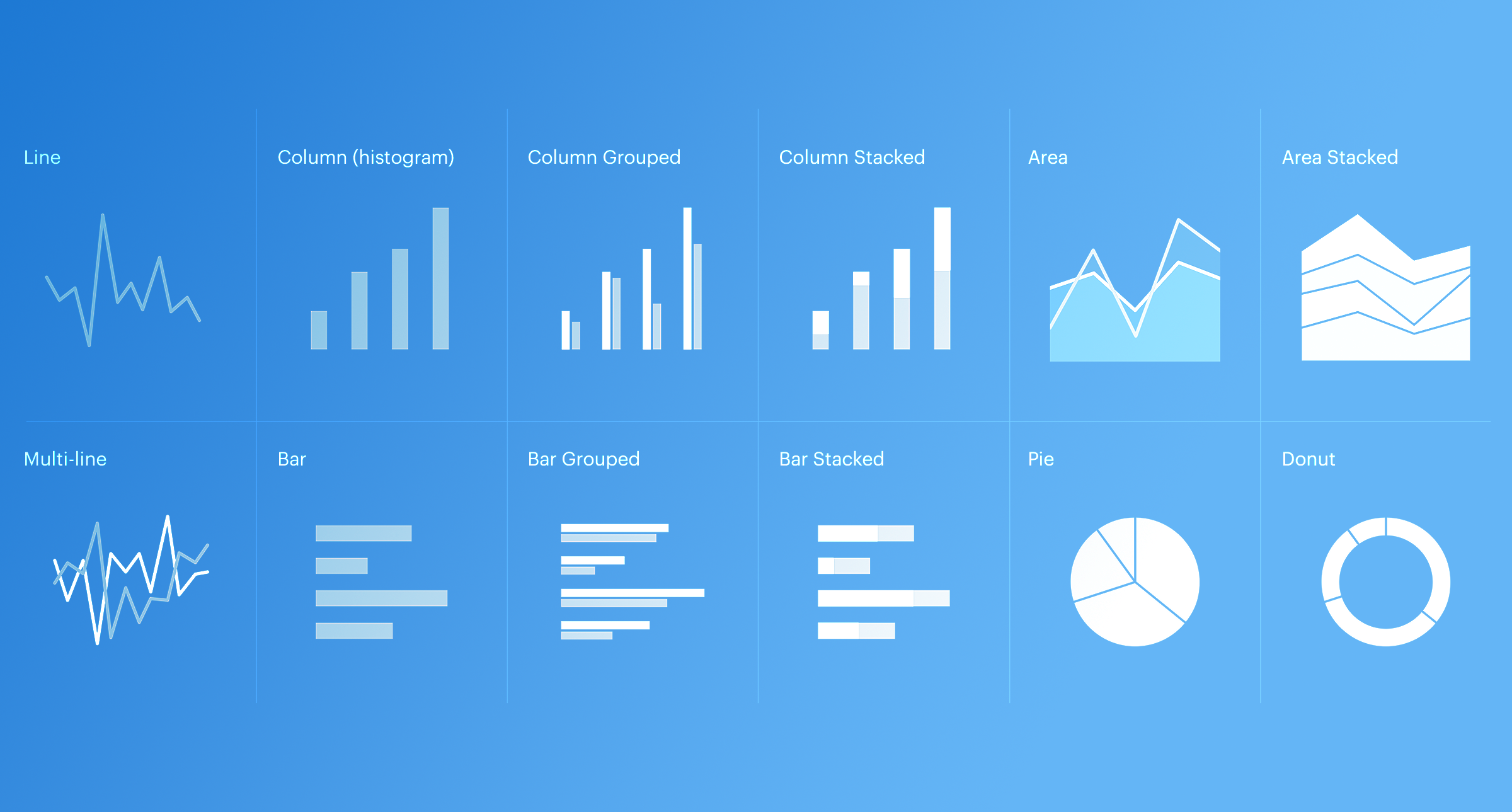
In recent years our appetite for data has increased significantly. So too has the need for a consistent approach to data visualisation. This article is an introduction to the data visualisation system, how it works and how you can use it to create accessible, multi-brand graphs and charts.
Accessibility
Ensuring that your graphs and charts comply with WCAG’s AA accessibility standards is the number one priority. The data visualisation system has catered for this using several methods.
Supporting data
From an accessibility perspective supporting data is your friend. Put simply; supporting data is the information used in a graph or chart. This includes the data itself and (if possible) a caption to describe the key findings. As a best practice, all charts must contain supporting data within the meta tags, this allows screen readers to relay the information however, it does not necessarily make your chart accessible.
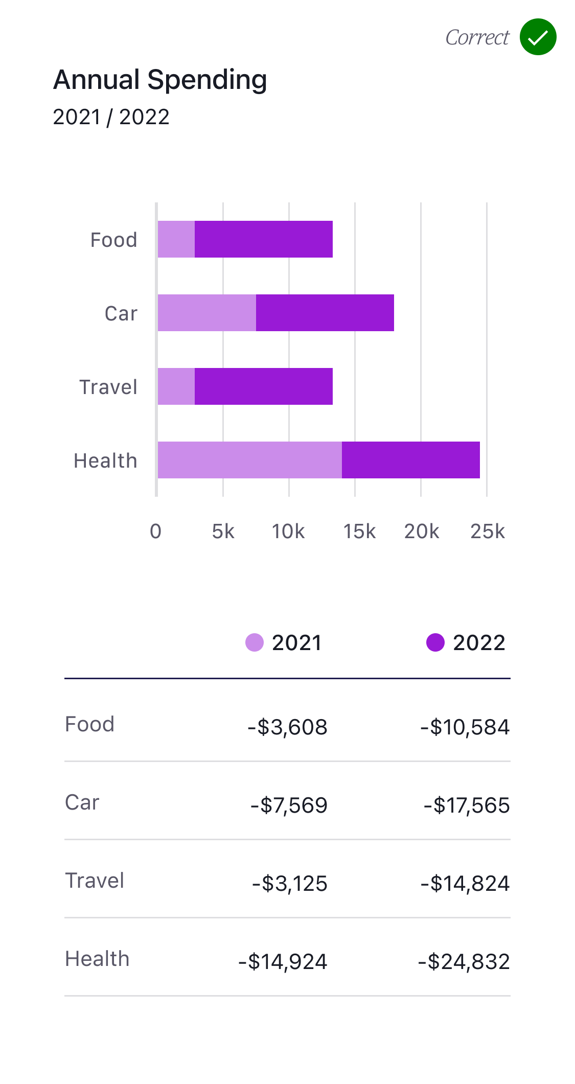
To further meet our accessibility requirements, any charts which use multiple categories must also display supporting data. Simply relying on the data being stored in the meta tags is not enough, we must also show it on screen. The example below demonstrates why this is the case.
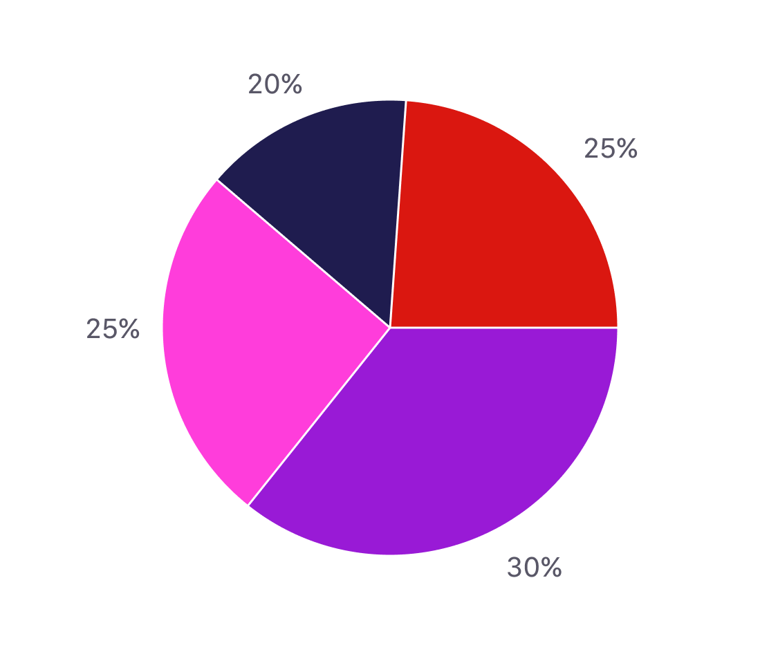
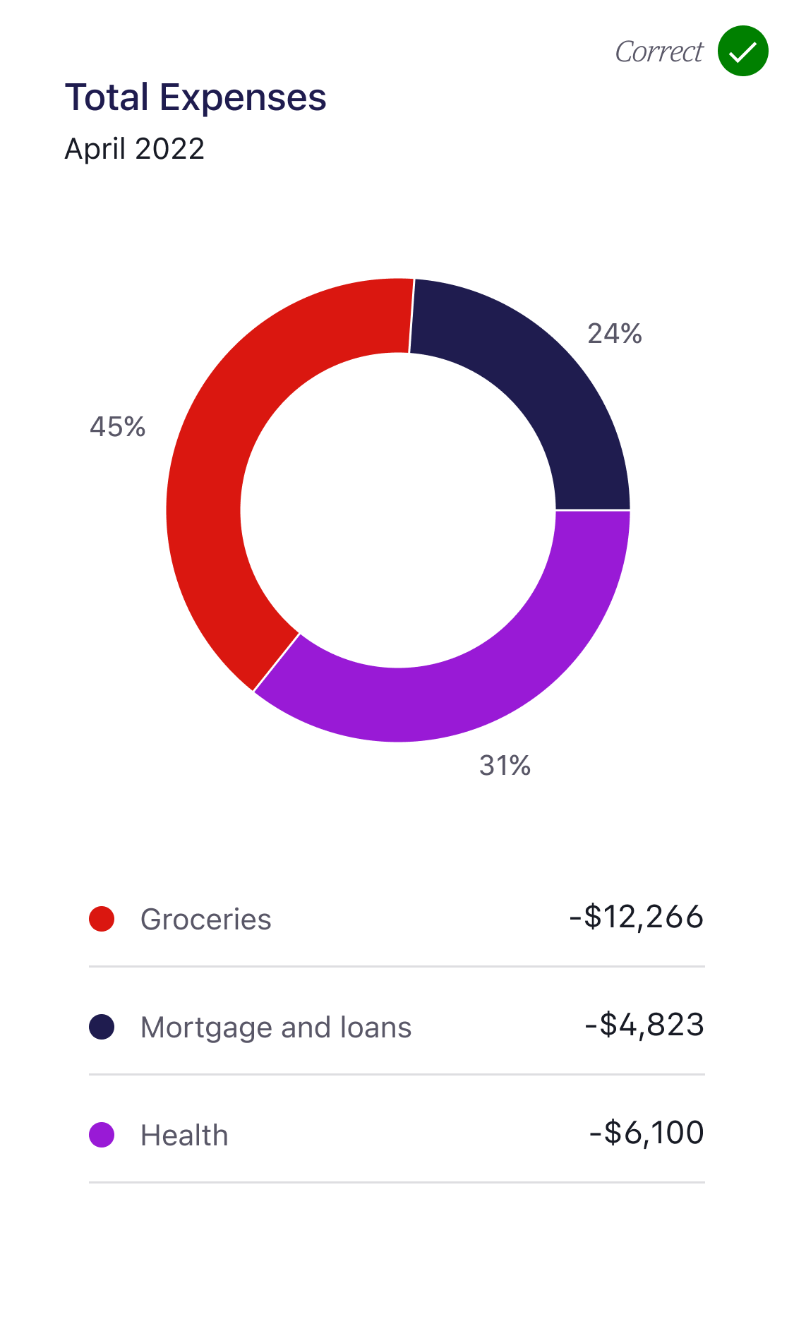
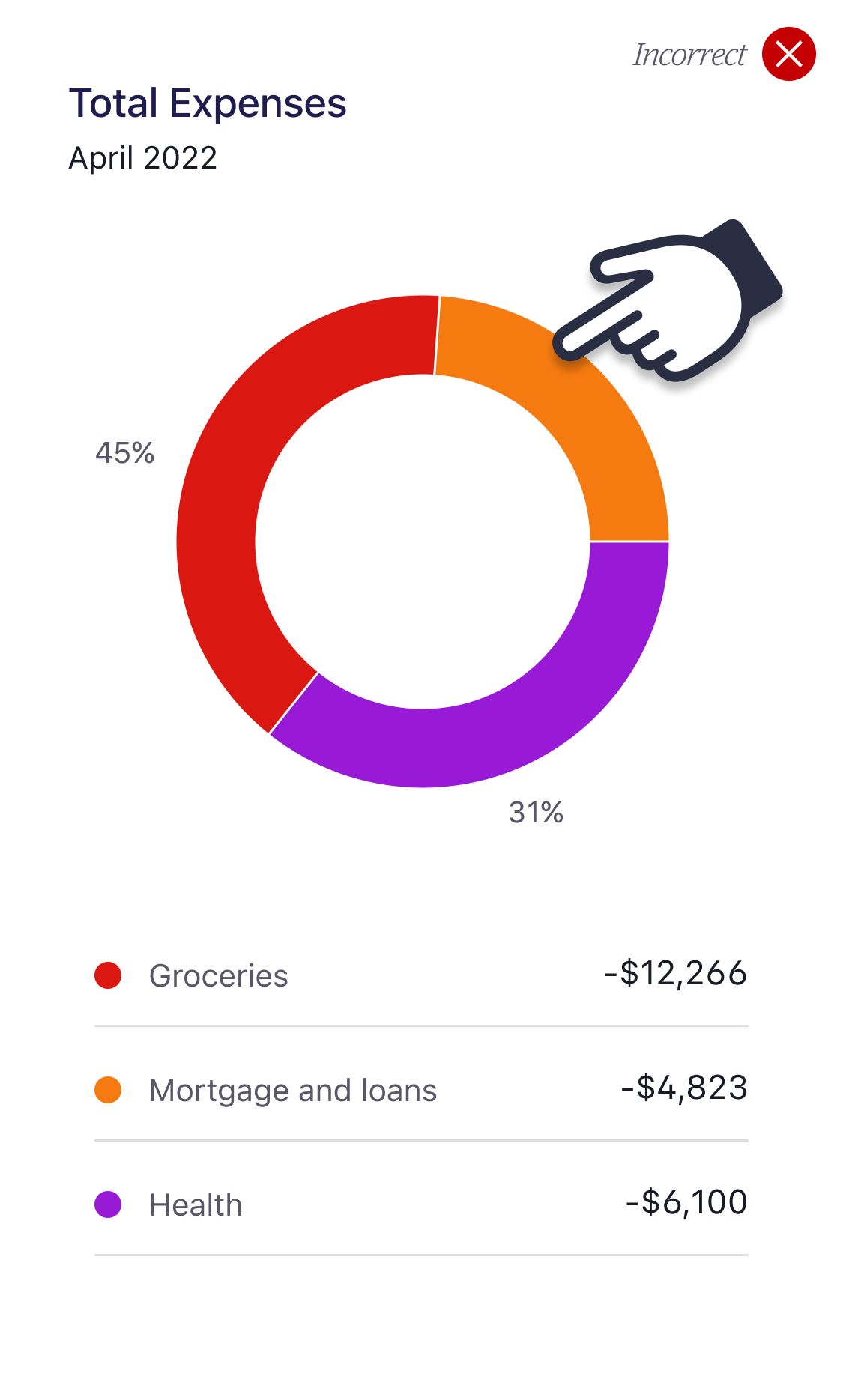
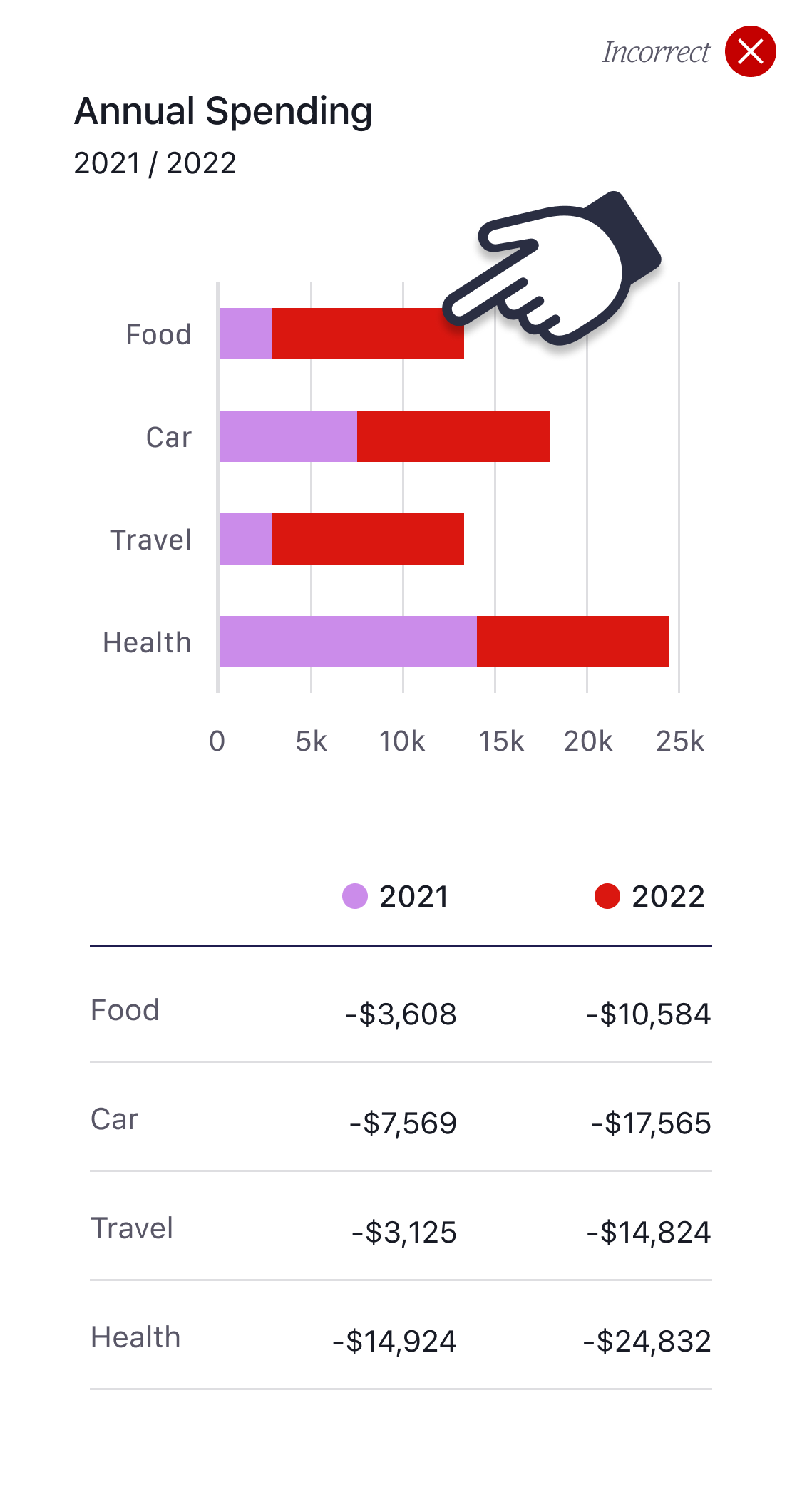
Fig.3 (below) shows our lovely colourful pie chart. All the colours in this chart pass the 3:1 contrast ratio. To all intents and purposes this chart would seem to be accessible, sadly this is not the case. Fig.4 demonstrates what a vision impaired customer would see. This is known as Achromatopsia (total colour blindness).
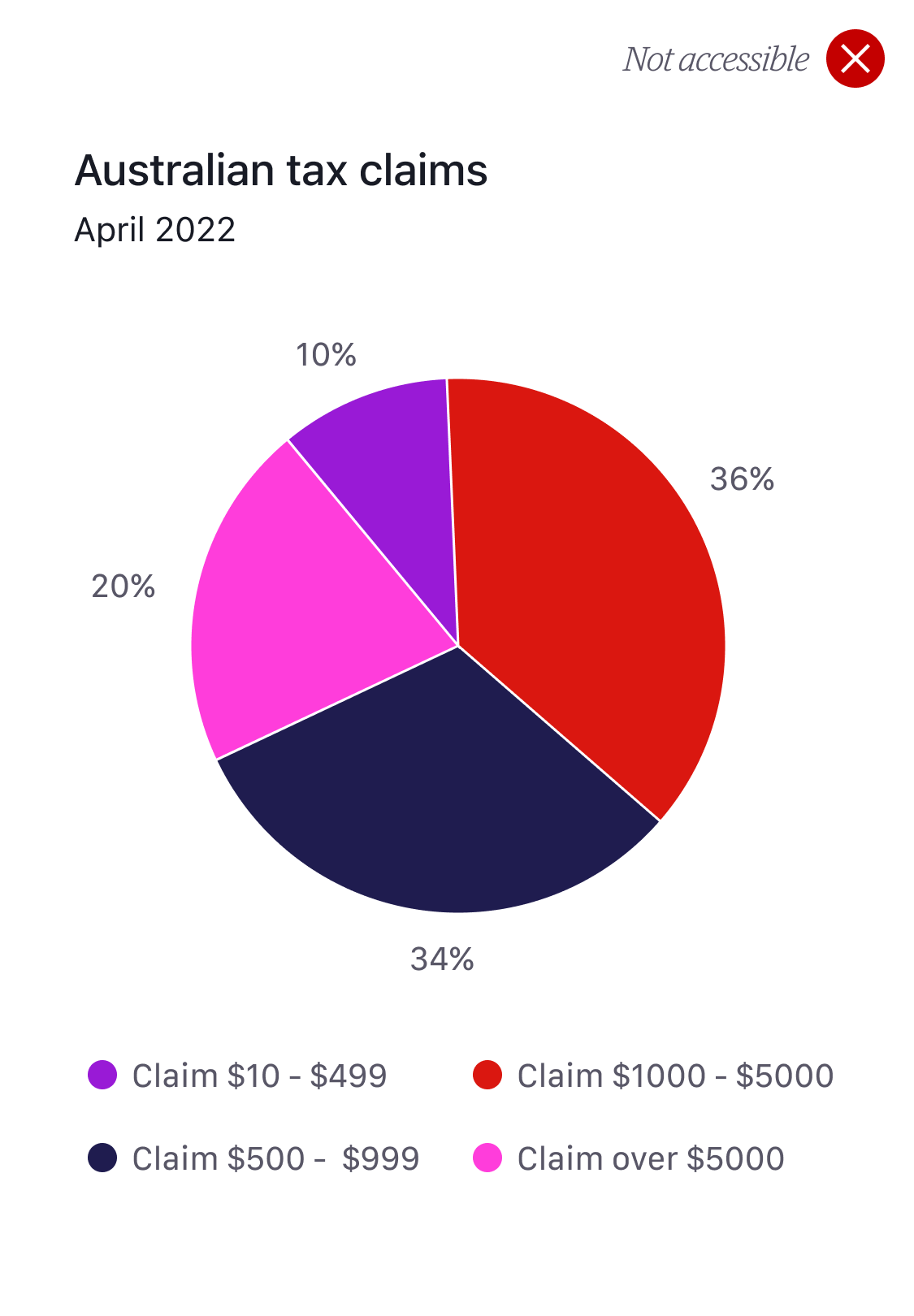
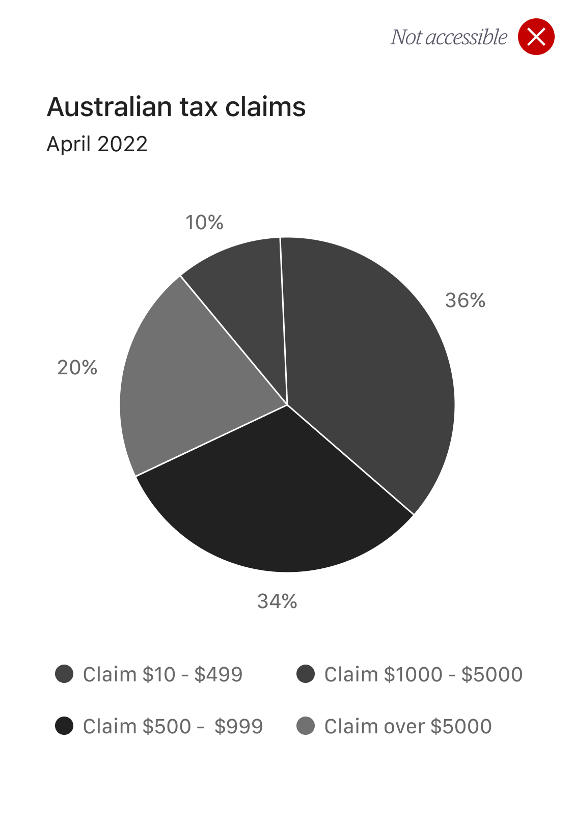
The issue lies in the key (fig.4). There is not enough contrast in these greys to identify each category so it’s a fail. To meet our accessibility requirements supporting data must be displayed with this chart.
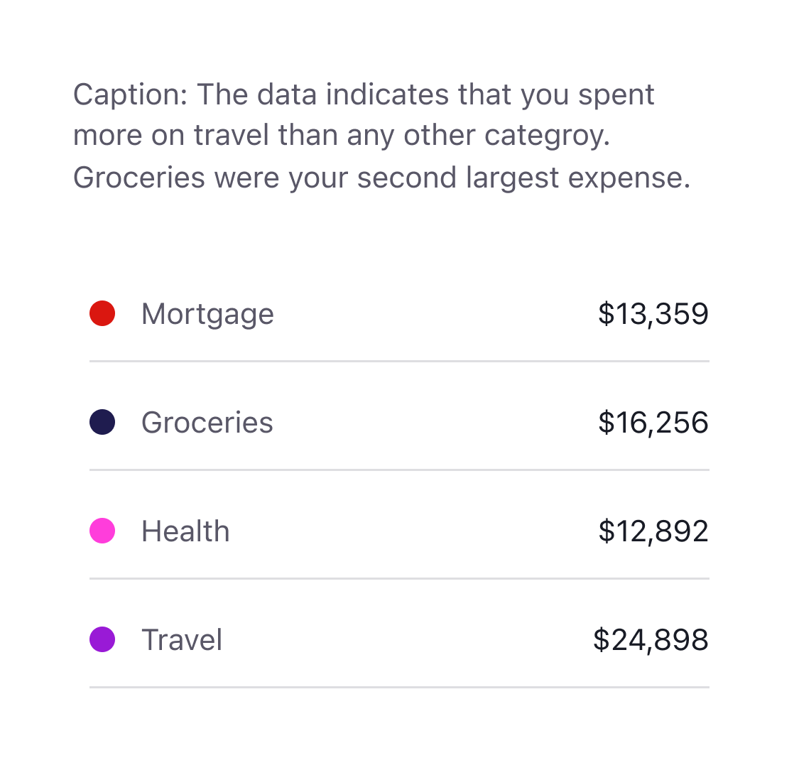
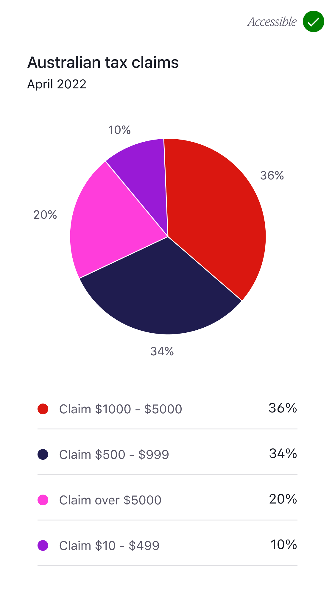
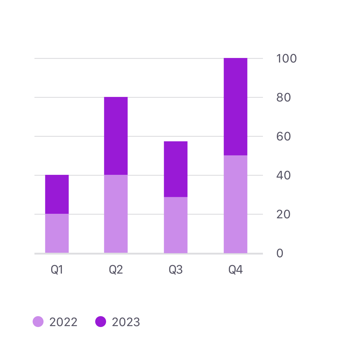
To make our pie chart accessible we have to display the supporting data as shown below (fig.6)

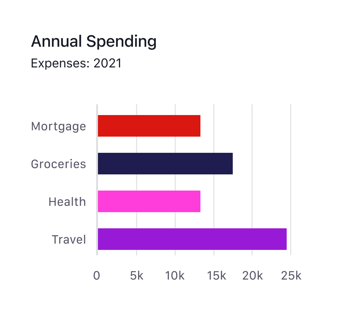
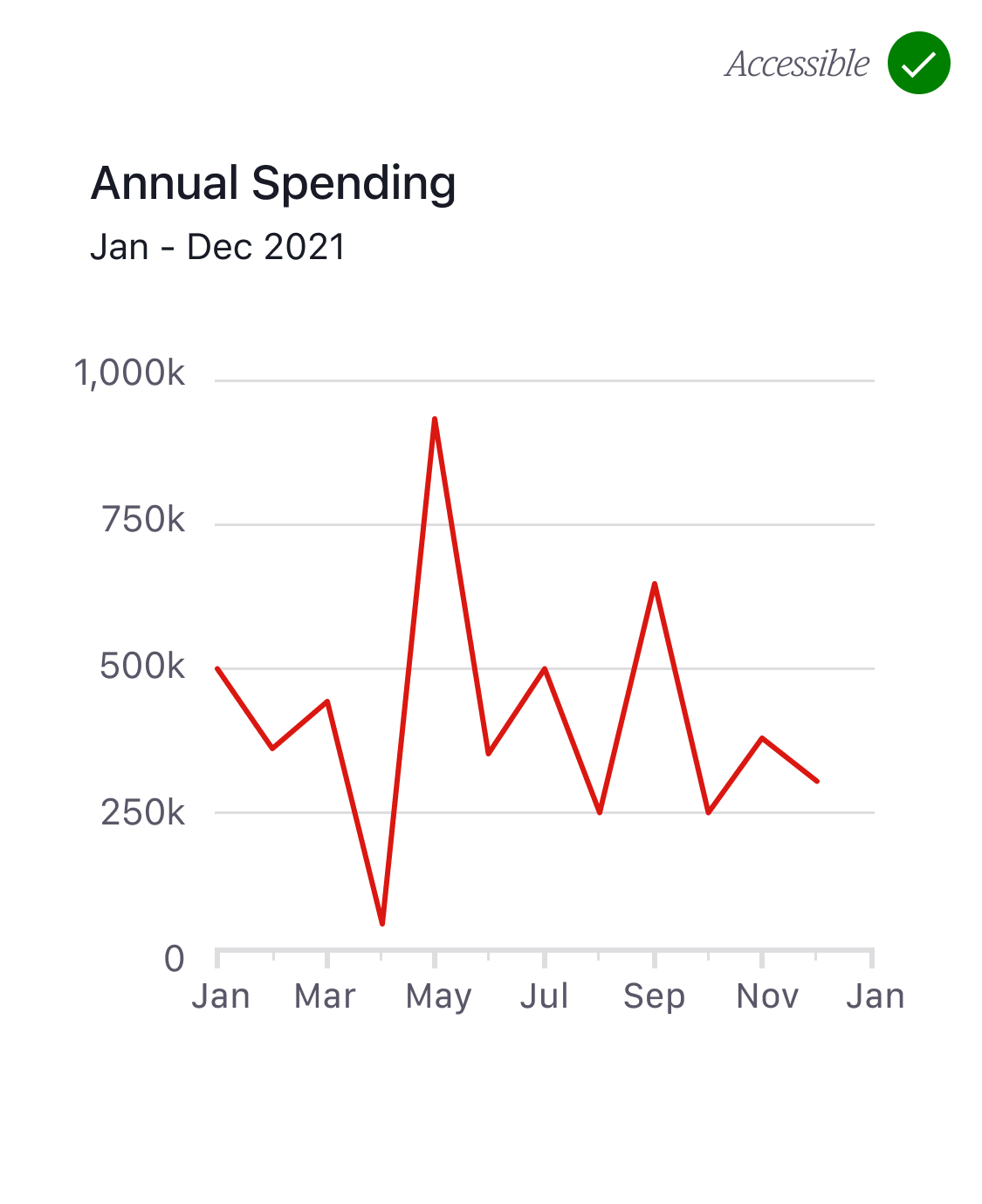
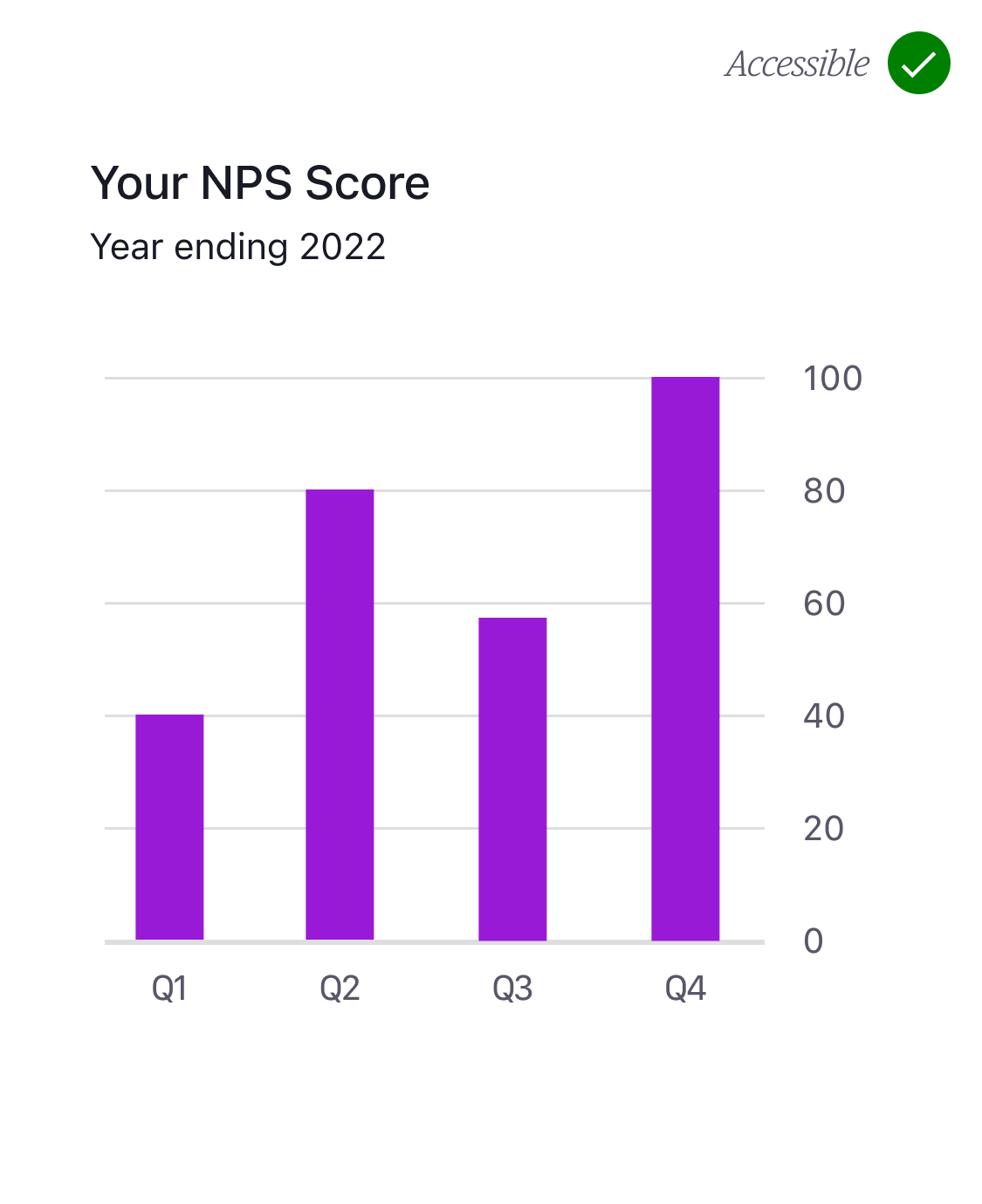
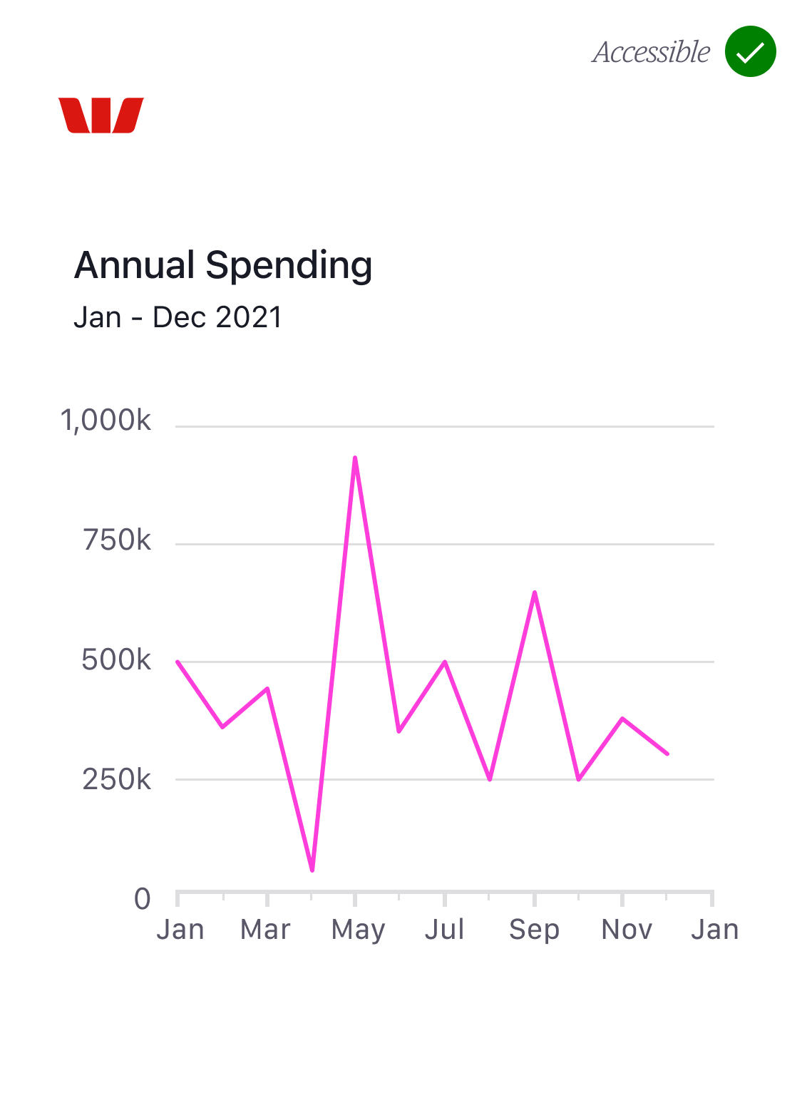
The exception to this rule is where charts only display a single category as shown below (fig.7 and fig.8).
These charts only use one category and therefore do not require a key. Providing the colour used in these charts passes the 3:1 minimum contrast ratio there is no need to display supporting data. We’ll cover this in more detail later.
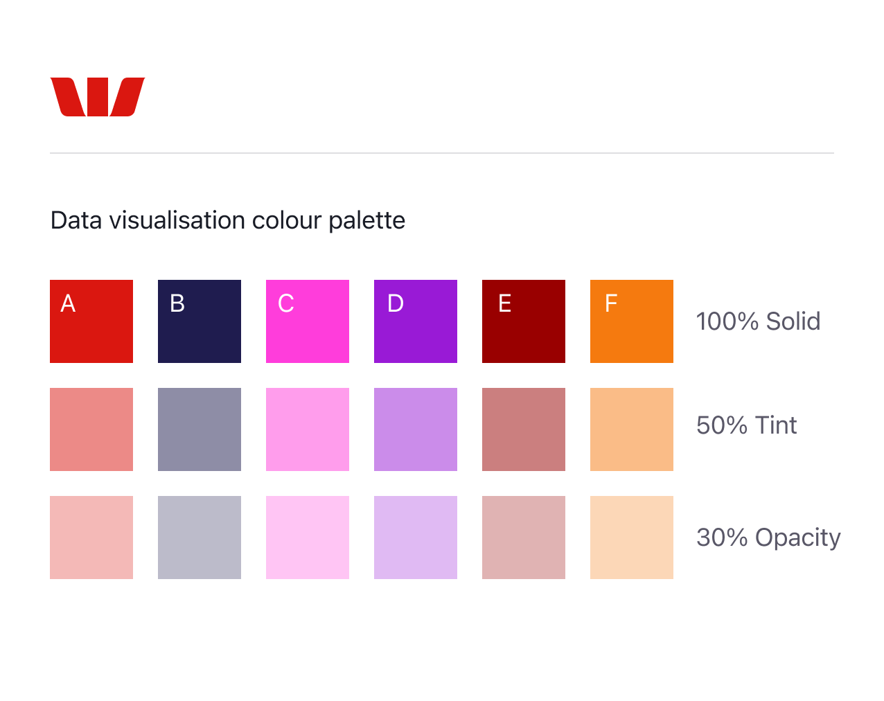
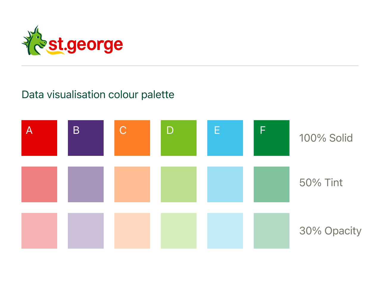
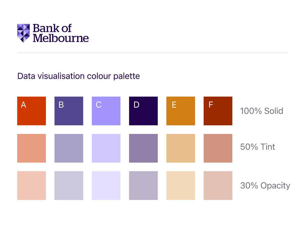
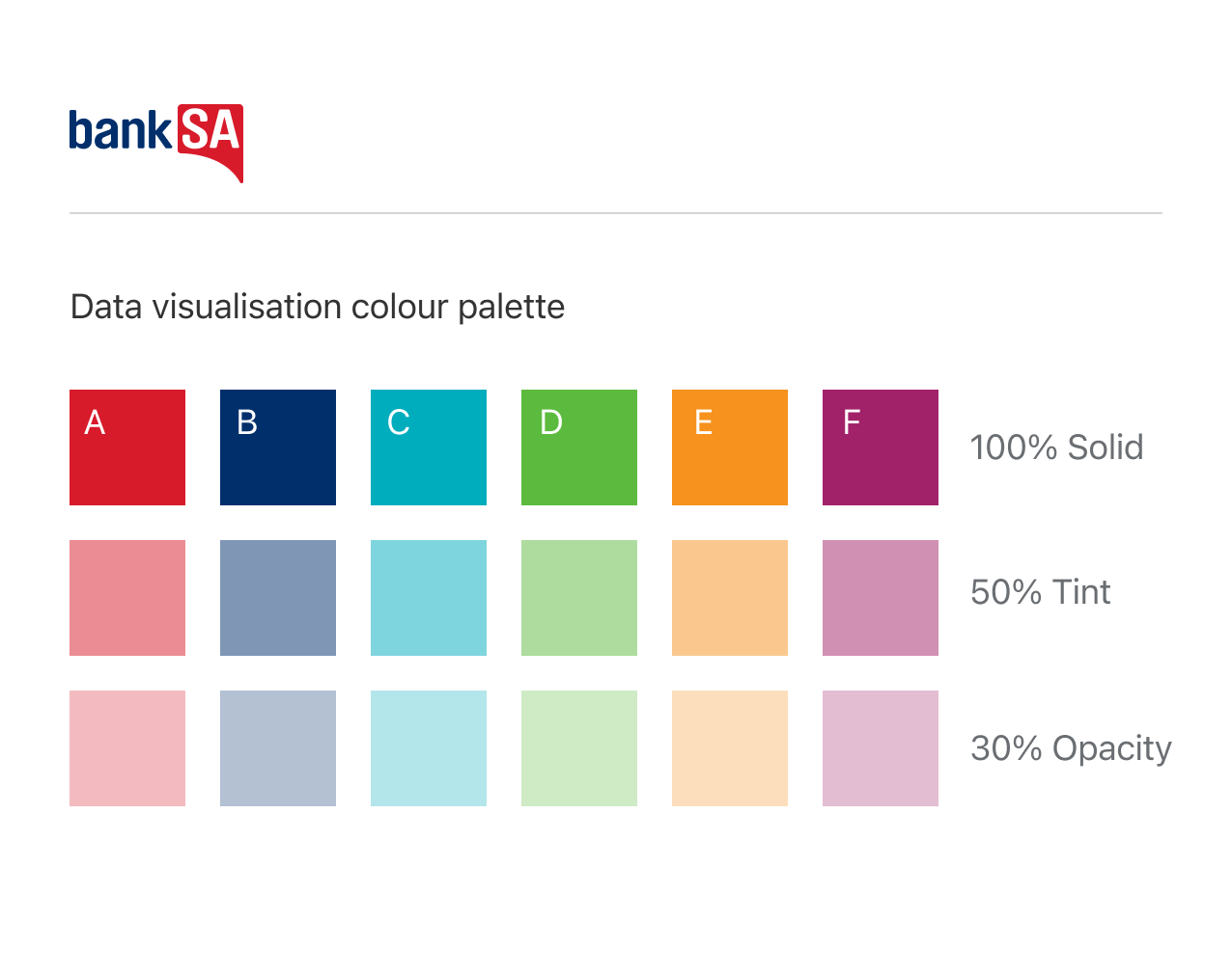
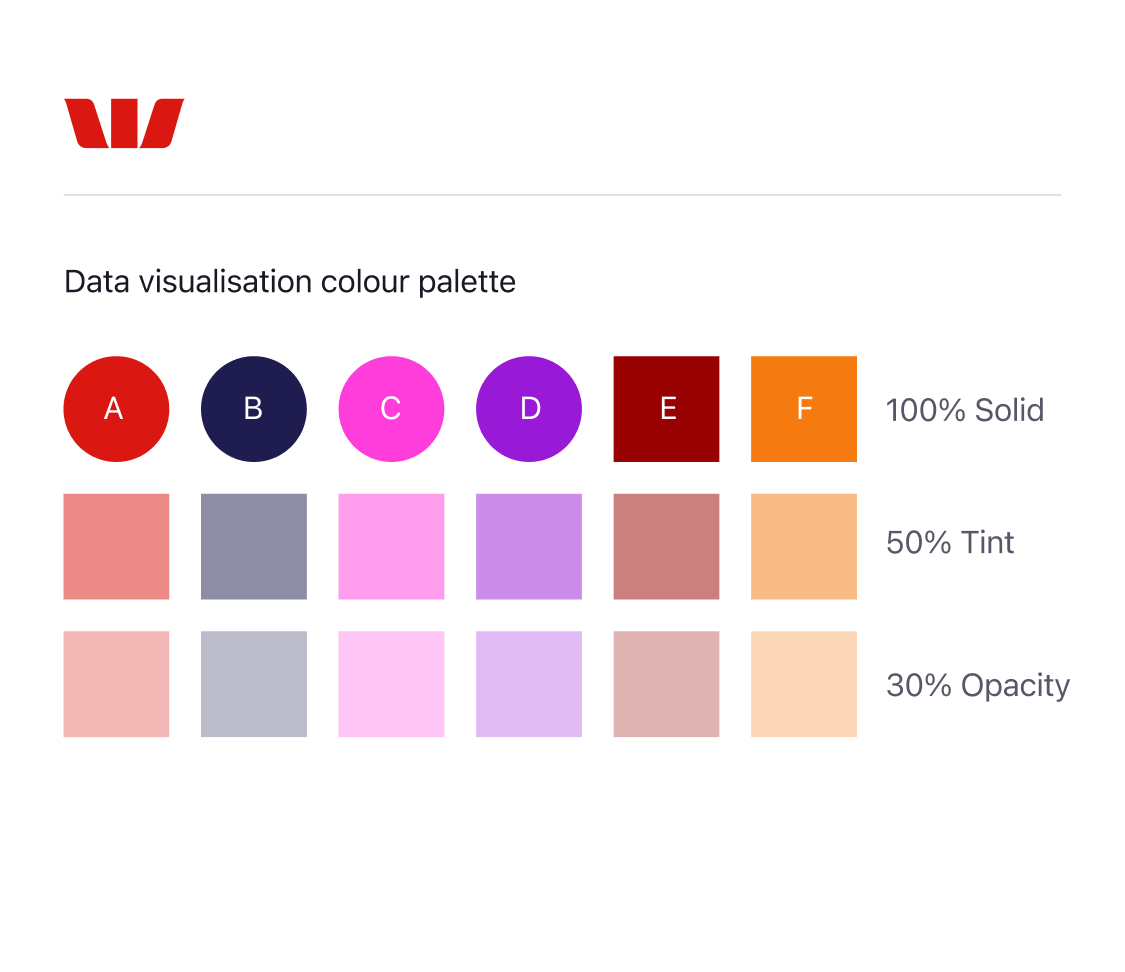
The colour system
From a multi-brand perspective the colour system is our friend. As a rule of thumb we recommend designers always assume that their chart (or indeed anything they design at Westpac) will at some stage need to be multi-brand.
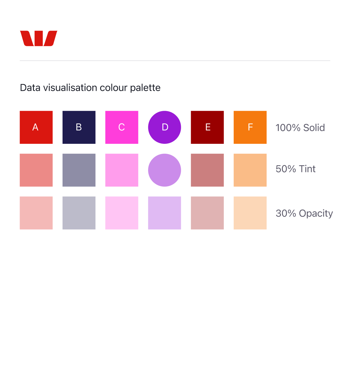
To assist designers with this we’ve created a data visualisation colour palette. Each brand provides 6 colours (A-F) for designers to use in their charts. Each colour has a corresponding 50% tint and 30% opacity. This set of 18 colours provides enormous scope and flexibility for a wide range of complex data visualisations. With that in mind, please avoid using additional colours, tints and opacities.
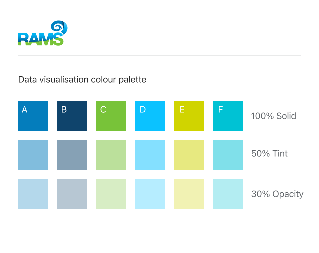
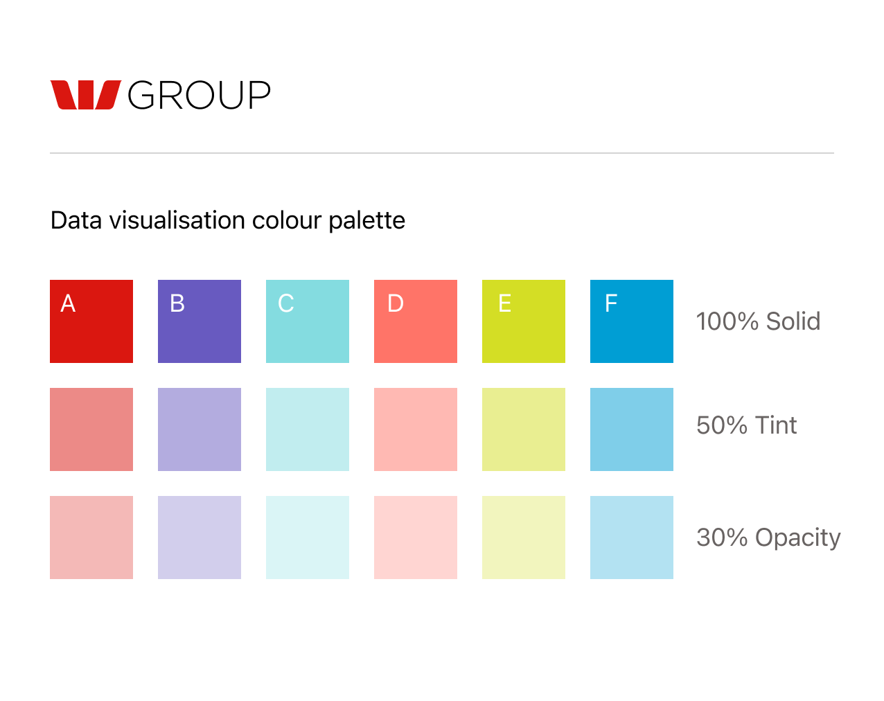
Examples
To give you some context, the following examples show how these colours are applied. Circular swatches indicate the colours used in the graph. In fig.9 below the pie chart uses the solid colours A-D as shown in fig.10.
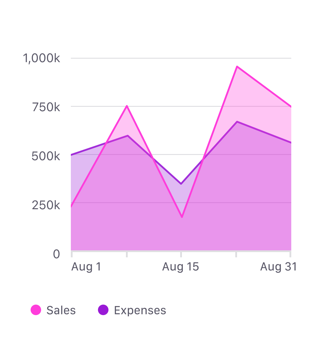
The comparison chart in fig.11 shows how a tint is used with its corresponding solid colour (fig.12) and the area chart in fig.13 shows how the transparent colours are used with their corresponding solid colours (fig 14).

Colour hierarchy
We just looked at where to use these colours. Now we’re going to look at when to use them. As mentioned earlier, each brand provides 6 colours for designers to use in their charts. See fig.15 below.
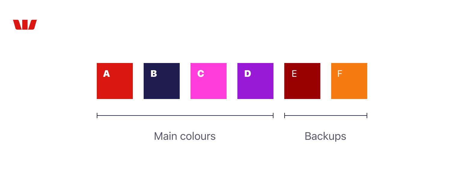
The first 4 colours (A–D) are the main set and should ALWAYS be the first choice. The last 2 colours (E–F) are backup colours and must ONLY be used as a last resort for charts that require more than 4 categories.
Incorrect use of these colours will dilute the consistency and integrity of the brand. If you’re unsure how to apply these colours or have any concerns please ask your design principle for help. We also recommend informing the business whenever you use the backup colours in charts as they are strictly governed, and only for use in edge-case scenarios.
Do’s and don’ts
There are 4 key principles that guide the correct use of this colour system. Applying these principles will ensure that your charts are on-brand, accessible and systemised allowing you to re-use the chart in any of our Westpac Group brands. Not only will this save time, it will also reduce the margin for error and increase consistency.
1. Use the main set first
Always use solid colours from the main set before using colours from the backup set. The chart below (fig.16) uses the first 4 colours in the set (A–D), this is correct. The chart on the right (fig.17) uses the orange (colour F) from the backup set before exhausting the first 4 colours. This is not correct and will damage the integrity of the brand.
Always use colours from the main set before using colours from the backup set.
2. Don't use tints on their own
Avoid using the tint (or transparent) variations on their own. As mentioned earlier, these variations are intended to be used in conjunction with their corresponding solid colour. They should not be used in isolation. The comparison chart below (fig.18) shows the correct use of a solid colour with its corresponding tint, whereas fig.19 is an example of incorrect use of the tints.
3. Don't mix and match
Only use the tint (and transparent) variations with their corresponding solid colours (as shown in fig.20). Never use tint or transparent variations with an alternative solid colour (fig.21). Tints and transparencies must only be used with their corresponding solid colours.
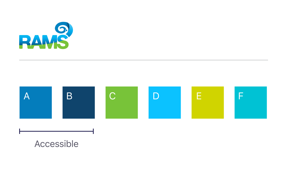
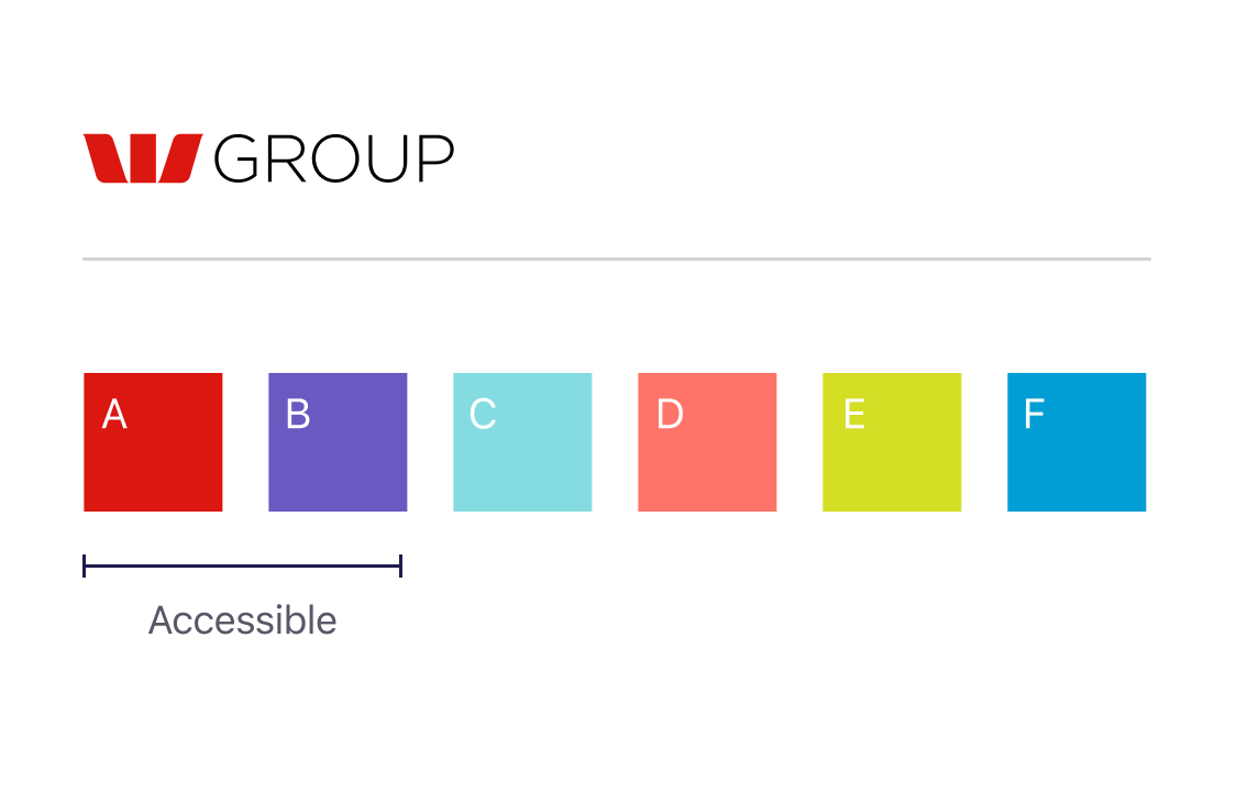
4. Know the accessible colours
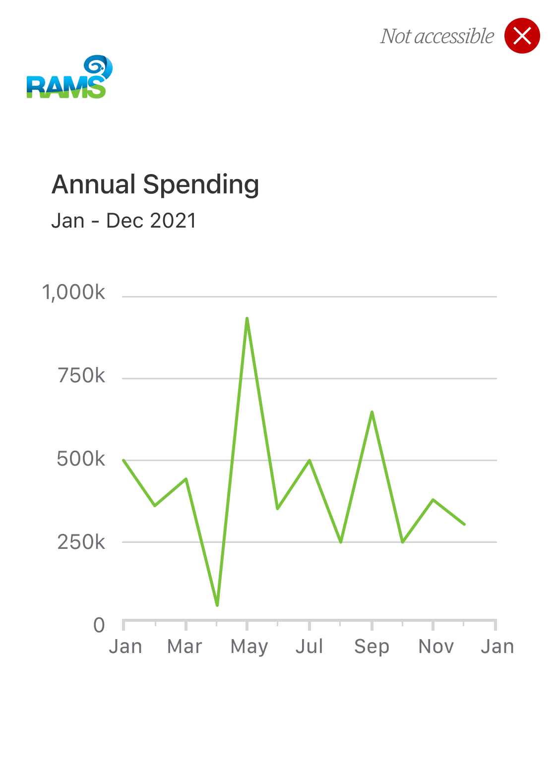
As mentioned earlier, simple charts that use a single category are not required to display their supporting data, however they must use an accessible colour that passes the minimum 3:1 contrast ratio for UI components and graphical objects.
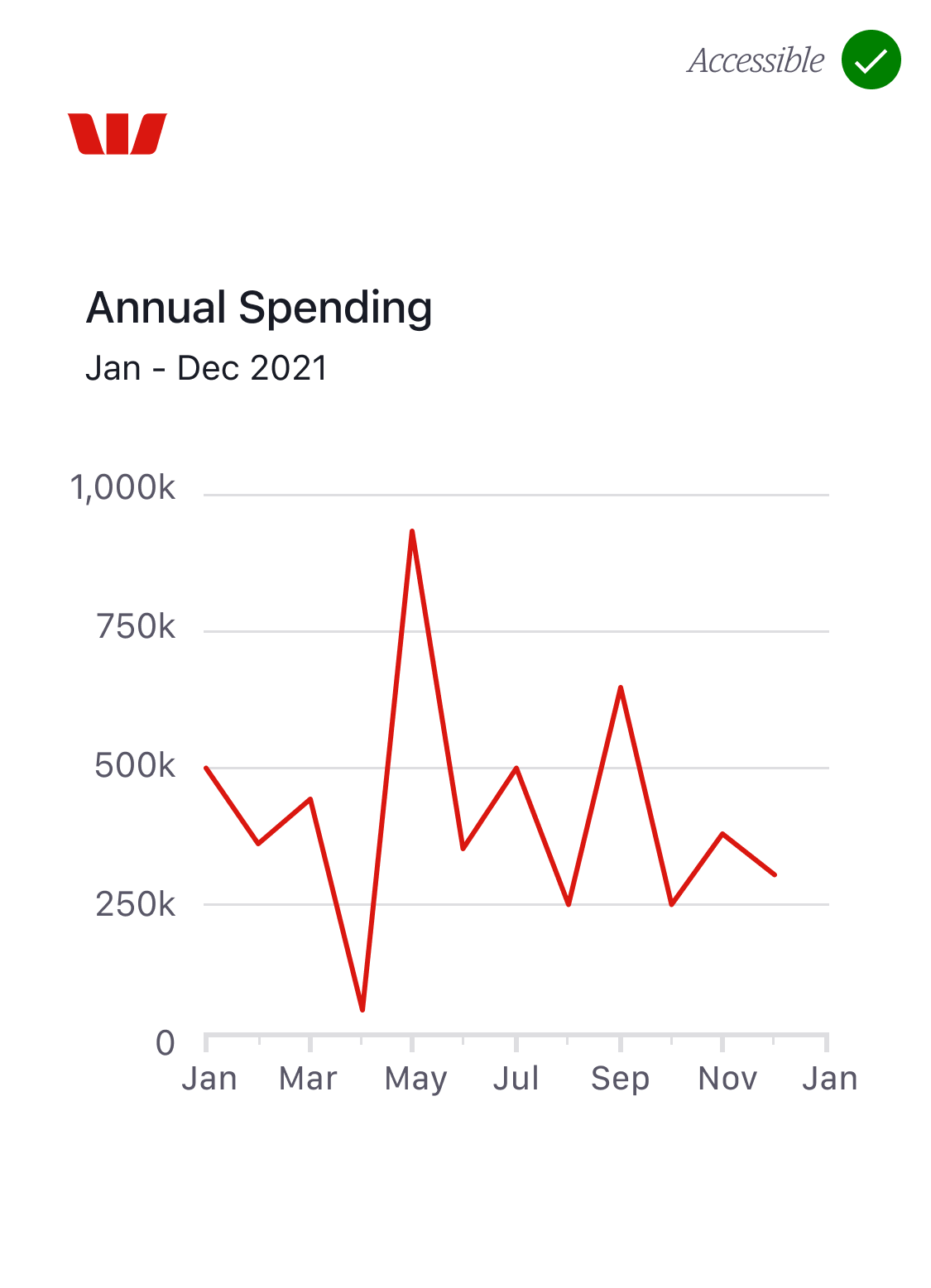
Fig.23 below shows a simple Westpac line graph. This graph uses colour C from the Westpac data visualisation palette. When this graph is converted to Rams (fig.24) it automatically applies colour C from the Rams palette. Unfortunately the Rams colour is not accessible and therefore the graph will fail to meet accessibility requirements.
If your chart needs to be multi-brand (and we’ll assume it does) you will need to ensure that whatever colour you choose is accessible in all of the brand palettes.
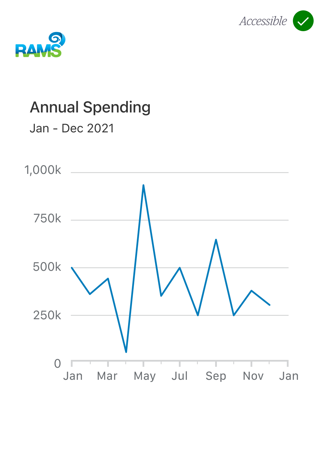
To make life easier we’ve structured the colour tokens to accommodate this scenario by making the first 2 colours (A & B) accessible in all brands. There are other accessible colours in these palettes, however, A and B are the only colours that are consistently accessible across each brand.
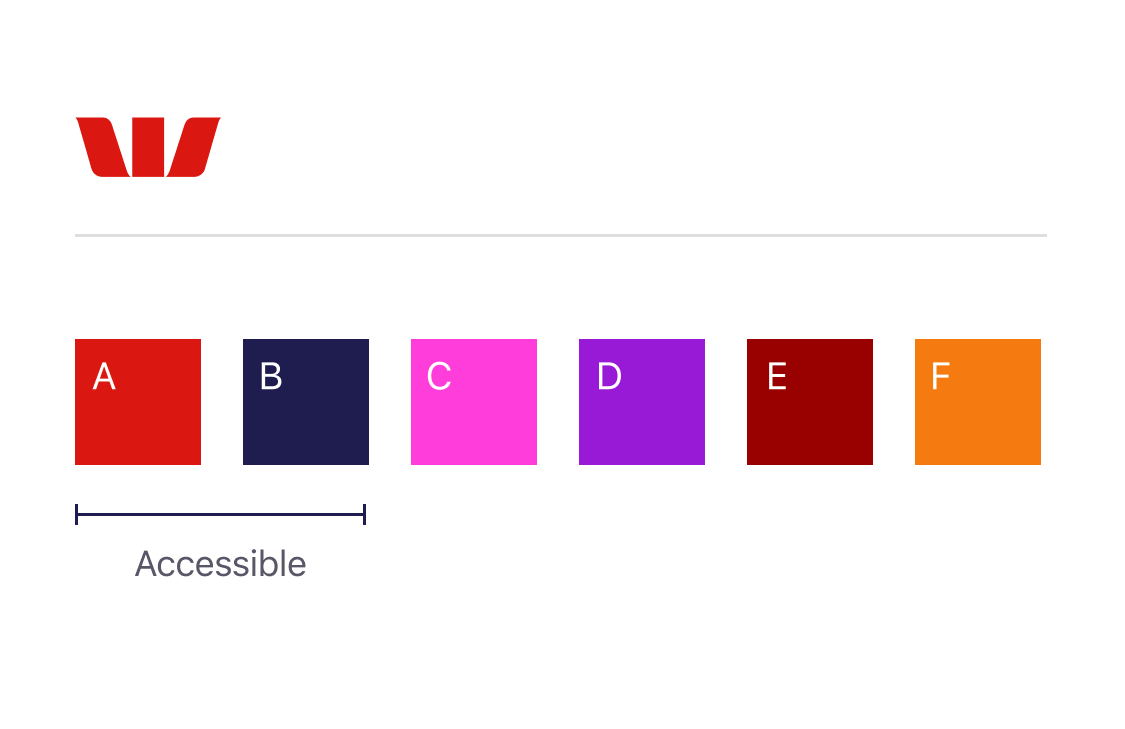
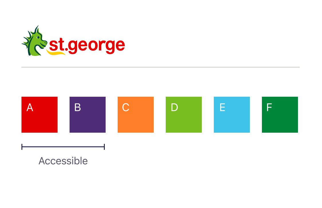
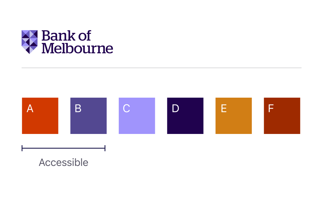
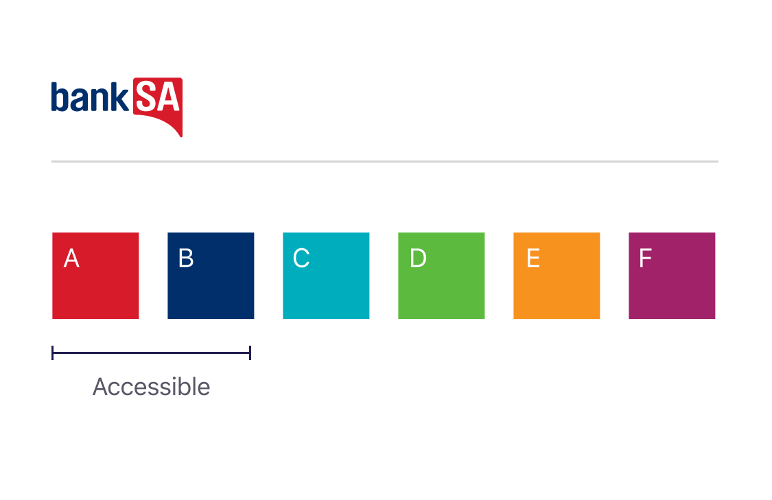
If you want to take advantage of this system, using either of these colours (A or B) will ensure that the charts are both accessible and multi-brand with no additional re-work. Fig.25 shows our updated Westpac line graph which now uses colour A. When this graph is converted to Rams (Fig.26) it automatically applies colour A from the Rams palette which is also accessible.
Hopefully this has given you some direction on how to create data visualisations. At the time of writing this system was in its infancy, we'd love to see what you do with this and get your feedback, comments and ideas so we can continue to improve the way we display and communicate data to our customers.